Vor Kurzem aufgerufene Suchen
Keine vor kurzem aufgerufene Suchen
Format issue: Macro Menu Location Moved on March 30 - now covers part of forms

Gepostet 31. März 2022
Feature Request Summary:
The macro menu used to be aligned immediately to the right of the form fields and was aligned with the ticket comments. As of March 30, 2022 the macro menu is now left aligned and longer, covering the bottom portion of the form fields.
Description/Use Cases:
The macro menu used to be located immediately below where you were typing a reply to the customer and was easier to access. It didn't interfere by covering up any of the form fields.
Business impact of limitation or missing feature:
Fewer fields are visible at one time making more scrolling necessary. It is also less easy to access the macros now with the change in position.
Other necessary information or resources:
It appears to be a formatting error that happened during some other maintenance and changed the alignment of this field. Please fix it! 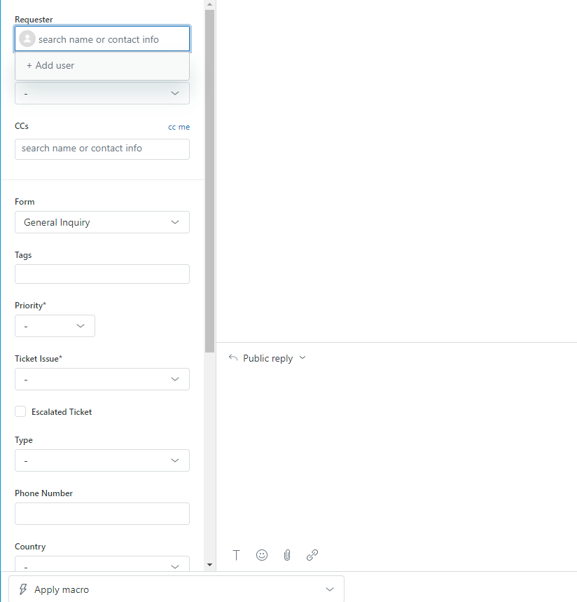
7
5 Kommentare
Offiziell
JJ Miclat
Hey Trudy Slaght!
Moving the macro menu to the left side of the interface was an intentional decision on Zendesk’s end for the following reasons:
We do hear you load and clear on the extra space taken up by the macro menu covering a part of the ticket fields section. We’re making some enhancements in the following weeks to reduce the vertical spacing between each field, so that agents could see more fields in the default width of the ticket fields panel. I’ll keep you posted.
0
CJ Johnson
We've got a lot of folks who don't love this change, either. It makes it more difficult to scroll to the bottom.
3
JJ Miclat
We've reduced the vertical spacing between ticket fields (while still taking aesthetics into account), and removed the horizontal separator between the Brand and the Requester field, so that we maximize the amount of ticket fields agents could see in their default browser viewport.
-1
Becky
We also hate the move of the macros drop down to the far left. It literally does nothing but get in the way! It looks terrible too not being in line with the reply section. If you've made adjustments - it's still terrible!
Why do you guys constantly break what isn't broken!
Btw, I think you meant to say 'LOUD and clear'.
0
Anastasia Unruh
same here, got a lot of feedback from our agents that it is not intuitive having the macro drop down on the left :(
0