

After the administrator completes initial configuration of the components in Web Widget (Classic) from the Admin Center and works with their developer to add Web Widget (Classic) to their website, they can work with their developer to further customize the Web Widget (Classic), if desired.
This article is an overview for administrators about what advanced customizations are possible with the Web Widget (Classic). This article is meant to answer the question, "what else can I do with my Web Widget (Classic)?" It explains the customization process for administrators, and also points to developer documentation that web developers need in order to do the work.
If you’re a web developer (or an administrator who is comfortable doing website development on your own) and are looking for complete documentation about the API settings and commands described in this article, or additional code samples, see the developer documentation for the Web Widget (Classic) API instead.
This article discusses these topics and widget customizations:
- Planning for Web Widget (Classic) customizations
- Navigating Web Widget (Classic) API documentation
- Displaying the widget in a different language
- Prefill forms with user contact information
- Disabling ticket attachments
- Re-positioning the launcher
- Offsetting the widget placement
- Customizing the color of the widget elements
- Changing visible ordering in the widget
- Suppressing features on specific pages
- Customizing widget text
- Adding a subject line to the contact form
- Hiding the "View Original Article" button
- Limiting search results
- Customizing the help center search placeholder text
- Advanced configuration of Talk in the Web Widget (Classic)
- Advanced configuration of Chat in the Web Widget (Classic)
- Offering end users multiple contact options
- Formatting code for multiple Web Widget (Classic) elements
For information about adding the Web Widget (Classic) to your site, see Using Web Widget (Classic) to embed customer service in your website.
For a complete list of Web Widget (Classic) documentation, see Web Widget (Classic) resources.
Planning for Web Widget (Classic) customizations
Most Support administrators aren’t web developers and work with someone else to implement customizations to the Web Widget (Classic). They don’t customize the Web Widget (Classic) and websites on their own. They work with a web developer at their company, or an outside developer that they use on a contract basis to implement the changes.
The web developer is the person who does the customization work, and they do it by adding some code (the Web Widget (Classic) API) to the HTML of the website. However, the administrator still has a role to play in the work. They need to understand what customizations are possible for the Web Widget (Classic), and tell the web developer what they want.
Some administrators have experience with HTML and choose to do the customization work themselves, acting as their own developer, and that's fine. Either way, customizing the Web Widget (Classic) is actually a process for the administrator that requires some planning and involves these steps:
- Review the information in this article to understand what advanced customizations are possible.
- Meet with key stakeholders at your company to create a list of requirements for your Web Widget (Classic). What colors do want to use? How do you want the Web Widget (Classic) to behave?
- Prepare a list of the customizations you want. Be as specific as possible and include links to API documentation that your web developer can reference.
- Give the list to your web developer, who will customize the Web Widget (Classic) by modifying the HTML of your website.
Navigating the Web Widget (Classic) API documentation
Here’s some important information to help developers navigate the Web Widget (Classic) API documentation on the Zendesk developer site.
Updated, organized developer docs and API syntax— The Web Widget (Classic) API syntax has changed, and we’ve also reorganized the Web Widget (Classic) API developer documentation to make it easier to find the command or setting you’re looking for. The documentation is now organized by product channel (Help Center, Tickets, Chat and Talk) or by core settings and commands. For more information, see the developer documentation for the Web Widget (Classic) API.
New Chat APIs—For information about how the old Chat (Zopim) APIs map to the Web Widget (Classic) APIs, see Migrating from the Chat Widget syntax to the unified Web Widget (Classic) syntax.
Displaying the widget in a different language
By default, the Web Widget (Classic) embedded in a website displays text in the end user’s language, based on the language of their browser. For example, if the end user's browser language is set to de for German, the widget will appear in German for that user. If the widget is embedded in a help center, it displays text based on the help center language setting.
The Web Widget (Classic) supports a subset of Zendesk's supported languages. If the end user's browser language is not supported by the Web Widget (Classic), the widget defaults to English. If the widget is unable to obtain the language from the end user’s browser, the widget defaults to the language specified in Zendesk Support.
You can customize the widget so that it always appears in a specific language using the setLocale command. This command sets the language for only the widget and doesn't override your host page’s language.
For more information, see the developer documentation for the setLocale command.
Prefill forms with user contact information
You can save visitors to your site a few seconds and some annoyance or frustration by prefilling their name, email address, and phone number into contact forms. This includes ticket forms, pre-chat forms, and Chat offline forms. Use the identify and prefill settings.
You can also set user information to be read-only using the prefill setting, which is nice because you can avoid having duplicate user accounts in Support for the same person.
For more information, see the developer documentation for the identify and prefill settings.
Disabling ticket attachments
If you have enabled attachments for your tickets, users can attach files to tickets submitted from the Web Widget (Classic), by default. However, you can disable this option, if needed.
For more information, see the developer documentation for the attachments setting of the contactForm object.
Re-positioning the launcher
The default position for the Web Widget (Classic) is the bottom-right of the browser; when a user clicks on the Web Widget (Classic) launcher, it opens by expanding upward.
You can select a location for the Web Widget (Classic) that varies from page to page (placing it on the left or right side of the page, or moving it to the top of the page where it expands downward when clicked). Use the position setting to position the Web Widget (Classic) in the top-left, top-right, bottom-left, or bottom-right of the page.
For more information, see the developer documentation about the position setting.
Offsetting widget placement
You can use the offset setting to reposition the Web Widget (Classic) on your desktop or mobile devices. Use the initial position setting as the point of reference, and then use the offset setting to move the Web Widget (Classic) horizontally, vertically, or both from that position (in pixels).
For more information, see the developer documentation for the offset setting.
Customizing the color of the widget elements
You can specify an overall color scheme for the Web Widget (Classic) (theme color) and a custom color for the text in the launcher, contact button, and header (theme text color) from the Web Widget (Classic) administration page (see Configuring components in Web Widget (Classic)).
However, if you want to customize specific elements, you need to use the color setting. You can choose a unique color for each of these Web Widget (Classic) components:
- Launcher
- Button
- Button text
- Results list
- Header
- Article links


For accessibility purposes, the Web Widget (Classic) automatically adjusts colors using an algorithm to guarantee a minimum contrast ratio as specified by the WCAG guidelines.
For more information about customizing the color of Web Widget (Classic) elements, see the developer documentation for the color setting.
Changing visible ordering in the widget
You can use the zIndex setting, one of the core Web Widget (Classic) settings, to set a new value and change how the Web Widget (Classic) appears in comparison to other elements appearing in the same location on your site.
For more information, see the developer documentation for the zIndex setting.
Suppressing widget features on specific pages
You can enable the Contact Form, Chat, Talk, and help center in the Web Widget (Classic) and then use the suppress setting to change the features offered on particular pages of your site to suit your needs.
- Have help center deflection on some pages
- Have Chat or the Contact Form without deflection on other pages
- Offer tiered service levels to signed in and identified users
For more information, see the developer documentation for the suppress setting.
Customizing widget text
You can change the text of the Web Widget (Classic) components in the table below, and you can also customize the help center search placeholder text.
| Component | Details |
|---|---|

|
Object: launcher Setting: chatLabel Description: Text on the launcher button when Chat is enabled and Help Center is not onDefault text: Chat |

|
Object: launcher Setting: label Description: Text on the launcher button Default text: Help, Support or Feedback, defined on the Web Widget (Classic) Admin page |

|
Object: helpCenter Setting: title Description: The title of the Help Center page Default text: Help |

|
Object: contactForm Setting: title Description: Title of the contact formDefault text: Leave us a message or Contact us defined on the Web Widget (Classic) Admin page |

|
Object: helpCenter Setting: messageButton Description: Text on the button in the help center form that loads the Contact form (~20 character limit) Default text: Leave us a message or Contact us defined on the Web Widget (Classic) Admin page |

|
Object: helpCenter Setting: chatButton Description: Text on the button shown in the help center form that loads the Chat (~20 character limit)Default text: Help, Support, or Feedback defined on the Web Widget (Classic) Admin page |
You use the translations object to change some of the default text displayed in the Web Widget (Classic). Translations are grouped by feature—for example, Launcher, help center, and Contact Form.
You can explore a list of potential language codes in Language codes for Zendesk supported languages.
The locale translations are triggered by the end user's browser language. You can also force the widget to always appear in a specific language and override the end user's browser language setting. For more information, see Displaying your widget in a different language.
Adding a subject line to the contact form
With the subject setting on the contactForm object, you can set the Web Widget (Classic) to include a subject field in the default contact form.
The default contact form is designed to promote engagement and offer a streamlined user experience when completing the contact form. While the default contact form does not include a subject line, you may want to add one to enhance the support experience for some customers.
For more information, see the developer documentation for the subject setting on the contactForm object.
Hiding the "View Original Article" button
The View Original Article button bridges the article in the Web Widget (Classic) and the article in the help center itself. You can hide this button by using the helpCenter object, and setting the originalArticleButton property to false.
For more information, see the developer documentation for the originalArticleButton setting for the helpCenter object.
Limiting search results
With the filter setting on the helpCenter object, you can limit the results of searches performed from the Web Widget (Classic) to articles based on category, section, and labels. For more information, see the developer documentation for the filter setting.
Scroll down for some additional examples that are not included in the developer docs that illustrate some of the ways you can limit search results.
To limit search to a specific section:
<script type="text/JavaScript">
window.zESettings = {
  webWidget: {
    helpCenter: {
      filter: {
        section: '200154474-Announcements'
      }
    }
  }
};
</script>
To limit search to a specific category:
<script type="text/JavaScript">
window.zESettings = {
  webWidget: {
    helpCenter: {
      filter: {
        category: '200053794-General'
      }
    }
  }
};
</script>
To limit search to content in multiple categories:
<script type="text/JavaScript">
window.zESettings = {
  webWidget: {
    helpCenter: {
      filter: {
        category: '115000669485,201742209'
      }
    }
  }
};
</script>
To limit search to content with a specific label:
<script type="text/JavaScript">
window.zESettings = {
  webWidget: {
    helpCenter: {
      filter: {
        label_names: 'orders'
      }
    }
  }
};
</script>
To limit search to content in a specific category and with specific labels:
<script type="text/JavaScript">
window.zESettings = {
webWidget: {
helpCenter: {
filter: {
category: '200053794-General',
label_names: 'Label One,Label Two,Label Three'
}
}
}
};
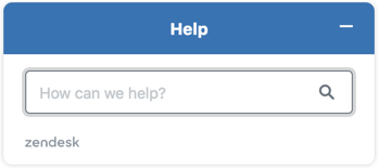
</script>Customizing the help center search placeholder text
The default placeholder text in the help center search box is How can we help? You can customize this text so that it matches the user’s language, or so that specific text appears in certain languages. For more information, see the developer documentation for the searchPlaceholder setting.
If Contextual Help is enabled, you can also configure the Web Widget (Classic) to open to recommended articles, making it easier for your customers to self-serve. For more information, see the developer documentation for the setSuggestions command for the helpCenter object.
Advanced configuration of Talk in the Web Widget (Classic)
You can create multiple configurations that define how Talk behaves in the Web Widget (Classic). With each configuration you can customize call routing and display options for Talk in the Web Widget (Classic), based on your needs and preferences.
-
The agent group that you want Web Widget (Classic) callback requests to be routed to
-
The priority of Web Widget (Classic) callback requests
-
Display Request a callback, Call us, or both of these options in the Web Widget (Classic)
-
Display an estimated wait time in the Web Widget (Classic)
If you have only created a single configuration of Talk in the Web Widget (Classic), this will automatically be the default configuration that displays in the Web Widget (Classic) whenever Talk is available.
If you have created multiple configurations of Talk in the Web Widget (Classic), you can use the Talk nickname setting to target the desired configuration.
For more information, see the developer documentation for the talk object, the nickname setting, and Configuring Zendesk Talk settings for the Web Widget (Classic).
Advanced configuration of Chat in the Web Widget (Classic)
If you are using the live chat in the Web Widget (Classic), you can offer Zendesk Chat functions in the Web Widget (Classic) so that visitors to your website can chat with agents, and send and receive files that might help with their problem. Agents can also send proactive messages to visitors, to see if they want or need any help.
For more information, see the developer documentation for the chat object.
For information about how the old Chat (Zopim) APIs map to the Web Widget (Classic) APIs, see Migrating from the Chat widget syntax to the unified Web Widget syntax.
Offering end users multiple contact options
You can allow end users to choose a contact option. You may want to customize your website so that some pages allow end users to make a choice and others don’t. The exact behavior depends on whether Chat or Talk is configured for the Web Widget (Classic), and whether a chat agent is online. You can customize the default text of contact options, if needed.
Here's a list of the default text:
| Contact option | Default text |
|---|---|
| Contact button | Contact us |
| Chat label (with agent online) | Live chat |
| Chat label (with agent offline | Chat is unavailable |
| Contact form label | Leave us a message |
For more information, see the developer documentation for the contactOptions setting.
Offering contact options with Chat
If Chat is configured for the Web Widget (Classic), end users are automatically routed to a chat, if a chat agent is available. However, you can allow end users to choose between chatting with an agent or completing a contact form, even if a chat agent is available. If a chat agent is available when the user clicks the launcher, but the agent signs off before the chat begins, the end users may see a message indicating that the agent is not available.
It's a known issue that when end users choose to chat, they cannot use the back button to return to the other contact options. To do so, they need to completely end the chat or refresh the page.
Offering contact options with Talk
If Talk and other contact options are enabled in the Web Widget (Classic), and agents are online, contact options are automatically enabled.
Formatting code for multiple widget components
Items that are specific to the Contact Form, Help Center, and Zendesk Chat are nested under those headings (contactForm, helpCenter and chat) in the HTML of your site, while global items are included separately.
- The position of the Web Widget (Classic) on the screen has been changed using the offset setting. Offset is a global item, which is why it has its own entry.
- Help center search—doesn’t include the View Original Article button. The title “Search for help” for English-language users, and “Have your say” for all other languages.
- Chat is disabled.
- The contact form title is “Message us” in English and “Contact us” in other languages.
- The launcher button text is “Make a request” in English and “Get help” in other languages.
<script type="text/JavaScript">
window.zESettings = {
  webWidget: {
    offset: { horizontal: '400px', vertical: '400px' },
    helpCenter: {
      originalArticleButton: false,
      title: {
        'en-US': 'Search for help',
        '*': 'Have your say'
      }
    },
    chat: {
      suppress: true
    },
    contactForm: {
      title: {
        'en-US': 'SMessage us',
        '*': 'Contact us'
      }
    },
    launcher: {
      label: {
        'en-US': 'Make a request',
        '*': 'Get help'
      }
    }
  }
};
</script>