After you create a query in Explore, you can change the format of your results to percentages, currency, timestamps, or custom formats using the Display format option in the chart configuration () menu. This article shows you how to set your results to one of Explore's pre-built formats or create your own customized format.
Changing results to a pre-built format
Explore automatically offers pre-built formats for your results. This section will describe each pre-built format and how to access them.
- In query builder, click the chart configuration icon (
).
- Select the Display format option.
- Click the drop-down list next to your metric. By default, all results are in standard format.
- Select a format option. There are five pre-built options:
- $: Reformats your results into dollars. If your results contain decimal numbers, they will be added as cents.
- €: Reformats your results into euros.
-
%: Multiplies your results by 100 and adds the percentage symbol (%).
Note: If you do not want to multiply your results by 100, you can add a percentage suffix as a custom format (see Customizing your result format).
- Finance: Displays two decimal values. If your results do not include any, two zeros will be added after the decimal point.
- Duration: Convert your results into the dd:hh:mm timestamp (days, hours, minutes). Your metric can only be converted into dd:hh:mm.
Your results are automatically converted to the selected format.
Customizing the result format
Use this section to learn about custom formatting options. You can use the steps in the section above to change your result format to the Custom option. If you want to display separate formatting, for different ranges of value in the same metric, you can use the Advanced option. See Adding conditional formatting.
To customize the result format
- In Query Builder, click chart configuration (
).
- Select the Display format option.
- Click the drop-down list next to your metric. By default, all results are in standard format.
- Select Custom.
You can customize your results with the following formatting options:

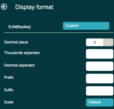
- Decimal place: Add or remove decimal places from your results. If your results do not contain decimal numbers, zeros will be added to your results.
- Thousands separator and Decimal separator: Enter a symbol to represent every thousand or the decimal point.
- Prefix and Suffix: You can add a symbol to the beginning or end of your result without altering your numbers. The suffix option is useful if you want to display your results as a percentage, but do not want to multiply by 100.
-
Scale: Divides your results by your selected option. You can select the following:
- 0.01 and 0.01
- Thousands, Millions, Billions, and SI Units
Adding conditional formatting for tables
For tables, you can display different formatting based on specified set of conditions, by selecting the Advanced option. With the Advanced formatting option, you can create new and edit existing IF THEN ELSE statements with your metric conditions and resulting formatting.
To apply conditional formatting for tables
- In Query Builder, click chart configuration (
).
- Select the Display format option.
- Click the drop-down list next to your metric. By default, all results are in standard format.
- Select Advanced.
The following are the formatting options you can apply:
- backgroundColor: Set the background color. Colors are represented by six digit HEX code.
- precision: Add or remove decimal places to your results. If your results do not contain decimal numbers, zeros will be added.
- scale: Divide your results by your selected option. For example, you can view your results to the thousandths by dividing by a thousand.
- prefix: Enter a symbol to appear in the front of values.
- decimalSeparator: Enter a symbol to represent the decimal point.
- italic: Enter TRUE to present values in italics, or FALSE to present them in regular font.
- bold: Enter TRUE to present values in bold, or FALSE to present them in regular text.
- suffix: Enter a symbol to appear at the end of values.
- fontColor: Set the text color. Colors are represented by six digit HEX code.
- thousandsSeparator: Enter a symbol to represent every thousand.
The following query example uses conditional formatting to highlight the number of open tickets each agents have and quickly identify agents with an outstanding number of open tickets. Agents
The query uses the following formula to generate these results:
IF (COUNT(# Open Tickets) > 25) THEN
{
"backgroundColor": "#FF5733",
"precision": 0,
"scale": 1,
"prefix": "",
"decimalSeparator": ".",
"italic": FALSE,
"bold": TRUE,
"suffix": "",
"fontColor": "",
"thousandsSeparator": " "
}
ELIF (BETWEEN((COUNT(# Open Tickets)),10,25)) THEN
{
"backgroundColor": "#FFC300",
"bold": TRUE
}
ELIF (COUNT(# Open Tickets) <10) THEN
{
"backgroundColor": "#19C700 ",
"bold": TRUE
}
ENDIF
For additional resources for writing formulas in Explore see Formula writing resources
33 Comments
I want to apply conditional font colors to a result calculation, which I think should look like this:
IF (D_COUNT(Tickets) > 50) THEN
{
"backgroundColor": "",
"precision": 0,
"scale": 1,
"prefix": "",
"decimalSeparator": ".",
"italic": FALSE,
"bold": FALSE,
"suffix": "",
"fontColor": "",
"thousandsSeparator": ", "
}
ELIF (IS_NAN(D_COUNT(Tickets))) THEN
{
"backgroundColor": "#dddddd"
}
ELIF (SUM(Result Path Ticket DCount)<0) THEN
{
"fontColor": "#FF0000"
}
ELIF (SUM(Result Path Ticket DCount)>0) THEN
{
"fontColor": "#00FF00"
}
ELSE
{
"fontColor": "#30aabc"
}
ENDIF
However, when I try that, it is not doing anything even though I have negative (hopefully red) and positive (hopefully green) numbers in my result path calculation. What am I missing?
Hey Chris,
I am going to spin up a ticket for you so that we can get some account specific testing on this to see what behavior is being exhibited. You should be getting something from me shortly.
Is there a way to apply conditional formatting to Attributes? I'm just looking for a very simple, if the word Good is listed then it's green, and if Bad is listed it's red.
Does this not work on custom metrics and/or KPI visualizations? I have a custom metric ("Contribution") that I'm trying to color-code and give a simple +/- prefix to, but it refuses to display the format:
IF (SUM(Contribution) > 0) THEN
{
"prefix": "+",
"fontColor": "#bc3030"
}
ELSE
{
"prefix": " ",
"fontColor": "#2db52f"
}
ENDIF
Hey Rebekah!
I checked with our team on this and does seem like this feature isn't applicable on KPI Visualizations currently. They recommended that you suggest this on our Product Feedback page as a feature you'd like to see.
Hi! Is there a way to align the text of the table to the center?
Daniela Sanguino
Hi Daniela, yes there is!
After you create a table, in the Chart configuration menu, click Columns.
On the Columns page, make sure that Automatic alignment is not checked. Then, you'll see that for each column, you can change the text alignment.
I hope this helps and I've put that in the queue for an update to the docs soon! Thanks for bringing this up.
Hi! Is there a way to center a table to the middle of the widget? My tables are always left aligned in the widget and I don't like it, haha. Thanks!
Hey Fiona,
Any chance you could provide a screenshot of what you see on your end so we're both on the same page?
Let me know!
Hi Brett
Thanks! Please see below. I would like the table to be in the middle of the widget, not to the left. Thanks again!
Nothing in this post works when applied to explore reports, even when copying and pasting.
@... I confirmed with one of our Explore experts and it doesn't look like there's a way to center this in the widget at this time.
Let me know if you have any other questions for me!
Christopher C. are you receiving any sort of errors when trying to copy and paste the formula? Any additional information you can provide is greatly appreciated.
Thanks!
Hello Brett,
Even when I open the Display format>Advanced and change nothing, it already gives an error.
Thanks for the update Christopher!
Definitely odd that you're receiving this error.
I'm going to generate a ticket on your behalf so our Customer Advocacy team can look into this with you.
You'll receive an email shortly stating your ticket has been created.
Cheers!
Hi all,
I have found conditional formatting is not possible when the metric name includes parenthesis. Is there any workaround besides renaming the metric / creating a new one for build-in metrics?
Your help is greatly appreciated.
Hello Juan Arias,
We are going to be opening a ticket on your behalf so our dev team can look into this more. Right now, there is no workaround for this issue, but we hope to resolve this with you shortly. You should receive an email followed by a response from our dev team soon.
Best regards.
I have two queries that calculate the difference between created tickets and solved tickets for Agents and End users. I want the background to change colour based on the result, for example:
I have read the above post and get this "Advanced display format is not available with result metrics". Even the most budget of excel rip offs have a feature that formats a result based on criteria so why cant i do it?
I find quite a large number of things on Zendesk (Explore and Support) very limiting and for a system as powerful as it is, the basics seem to have been overlooked making it not very user friendly in certain instances.
David Pritchard I was able to get mine to work. Here's what I used:
IF (SUM(Result Path Ticket DCount) > 0) THEN
{
"backgroundColor": "#ffffff",
"precision": 0,
"scale": 1,
"prefix": "",
"decimalSeparator": ".",
"italic": FALSE,
"bold": TRUE,
"suffix": "%",
"fontColor": "#00FF00",
"thousandsSeparator": " "
}
ELSE
{
"backgroundColor": "#ffffff",
"precision": 0,
"scale": 1,
"prefix": "",
"decimalSeparator": ".",
"italic": FALSE,
"bold": TRUE,
"suffix": "%",
"fontColor": "#EB4962",
"thousandsSeparator": " "
}
ENDIF
This turns anything zero and below red, and above zero green. If you have two different calculations, you would need to add it to the Display format for each.
Chris Bulin I have no option to enter that anywhere
Hi David Pritchard thank you for the information. I use mine on a calculated metric rather than a result metric calculation. It looks like you can't use the custom formatting on result metric calculations.
Hi all, I've just converted my first Dashboard over from Insights into Explore. Was quite a challenge to get my head around all the new features, but so far I'm liking it, and far better than having to jump into Good Data.

I have one issue I'm not sure if we're able to resolve as yet.
I would like to display/format my Update handling time (mins) metric to display in Hours and Mins as per my screenshot:
In the old Insights I think we just used a string formatter like this:
{{{||0}}} h {{{0.0166666666666|60.|00}}} m
Any ideas if this is possible in Explore advanced formatting formulas?
Thanks
Dan
Hi Dan! You can use the Duration Display Format to get the format to display into dd:hh:mm. Alternatively, you could use the Custom option and set 2 decimal places and a suffix. Neither of those exactly duplicate what you have, but they are the closest I can think of. I checked to see if there was any documentation about this, but they all refer back to using the Duration format.
Thanks Chris Bulin yes I can certainly get the duration working.
I guess I was hoping that the Advanced formulas for formatting could help here, but everything I've tried doesn't seem to work.
I know in EXCEL if I had my Metric in HOURS I could do something simple like this:
=IF(HOUR(C4)>0, HOUR(C4) & " h","") & IF(MINUTE(C4)>0, MINUTE(C4) & " m","")
Perhaps given so much of our SUPPORT ticketing is in minutes/hours the product team may add a few more possibilities for displaying time when converted from the standard minutes that most Support ticket metrics are available in.
I know what you mean Dan. For a hot minute I thought I could split the time on the colon and creating separate columns for hours/minutes like I do in Tableau, but sadly, that functionality does not exist (yet?) in Explore. Would be nice if it did.
Hi all, please do consider sharing this feedback in our community forum to give it more visibility to the product groups! - https://support.zendesk.com/hc/en-us/community/topics/360001200913
Thanks Rob.
I've created a post in the Explore Feedback forum
https://support.zendesk.com/hc/en-us/community/posts/360049081154-Custom-Format-for-MINUTES-display-X-h-X-m-
Dan
Hi,
I am new to Zendesk Explore and just created a query.
I have put as 0 decimal place for the ticket age metric result and it works in the dashboard. However, the data exported in excel format has many decimal places for ticket age field. May i check how can i format the excel report to be similar to the dashboard result? i.e. no decimal places for the field.
Is it possible to do simple formatting of the exported data in excel format during the schedule delivery of the file?
Thanks in advance for your help.
Hey Elene,
I went ahead and answered your question here: how to remove decimal places when exporting ticket data?
I hope this helps!
Is it possible to change metric's color based on the average in the column? Like that:
Hello Konstantin Annikov,
I checked with our product team, and this currently isn't a feature on our roadmap or something you can do natively. I've passed this on to our developers, but I would recommend sharing your use case in our product feedback forum.
Best regards.
Please sign in to leave a comment.