Recent searches
No recent searches
Custom Guide Colour Theme Selector
Posted Aug 25, 2018
The goal
In this tip I'm going to take you through the process of adding a custom theme selector to your Zendesk Guide. This will allow your users to select a theme from a dropdown menu that will change certain colours throughout the site.
We implemented this as a bit of fun for an internal site, but it could be used to add an accessibility theme for users who struggle with your default style.
The GIF below shows a very basic example of what can be achieved.
The Solution
The code can be broken down into three parts:
- Adding the theme selector to the footer
- Adding the javascript to make the theme selector work
- Adding the theme styles to your css
A quick note before we start; I'm customising a standard Copenhagen theme, but you should be able to apply the code below to any custom theme.
The theme selector
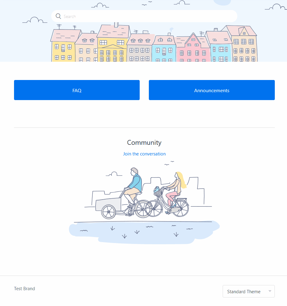
To get started, go to Guide Admin, select the Customise Design option, locate your theme and select Edit Code.
Open the footer.hbs file and paste in the following code between the `<footer>` tags:
 <div>
   <label id="theme-changer">
     <select name="theme" id="theme">
       <option value="default">Standard Theme</option>
       <option value="alt">Alternative Theme</option>
     </select>
   </label>
 </div>
The javascipt
In the same footer.hbs file add the follow code beneath the closing `</footer>` tag:
<script>

  // test for localStorage support
  var hasLocalStorage = function () {
    var mod = 'a';
    try {
      localStorage.setItem(mod, mod);
      localStorage.removeItem(mod);
      return true;
    } catch (e) {
      return false;
    }
  };

  // test for CSS custom variables support
  if (hasLocalStorage() && window.CSS && window.CSS.supports && window.CSS.supports('--a', 0)) {

    var themeChanger = $('#theme-changer'),
    root = $(':root'),
    themeInput = $('#theme'),
    currentTheme = localStorage.getItem('theme') || 'default',
    selectOption;

    // show the theme changer
    themeChanger.removeClass('hidden');

    // change colors and save to localStorage
    themeInput.on('change', function (e) {

      // change values to current theme
      currentTheme = $(this).val();

     // change values of custom properties and save to localStorage
     root.attr('class', currentTheme);
     localStorage.setItem('theme', currentTheme);

     });
  }
</script>
The script uses the user's brower's localstorage to remeber their selection as they navigate your site. The code also relies on CSS Custom variables, so this script makes sure that the user's browser supports both localstorage and custom variables and if it doesn't the theme selector isn't displayed and the user will just see the default theme.
Next - open your script.js file and paste the code below beneath `$(document).ready(function()` :
// Theme selector
 // set option of current theme to selected
 $('#theme').val(currentTheme);

// get values of custom properties and apply
 root.attr('class', currentTheme);
The CSS
Open your style.css and add the code below right at the top:
:root {
 --br-color: $brand_color;
}

:root.alt {
 --br-color: green;
}
In this example all we're doing is setting an alternative Brand Color, but you can change anything you like with this method. We're declaring a custom variable called `--br-color` which is equal to our default Guide Brand Color, and then adding an alternative color beneath it.
Now, for any class in our css that we want to apply the alternative theme option to we just need to add an extra line beneath the properties that use $brand_color, replacing it with our custom variable (by adding `var(--br-color)`). In this example it's the `.blocks-item`:
.blocks-item {
  border: 1px solid $brand_color;
  border: 1px solid var(--br-color);
  background-color: $brand_color;
  background-color: var(--br-color);
  ...
}
Duplicating the properties means that if the user's browser doesn't support CSS custom variables the standard, default, values will be used.
There is lots more you can do with this, but this simple example should get you started.
I have relied heavily on this article by Michael Scharnagl to put this together. I hope someone finds it useful!
1
3 comments
Jennifer Rowe
Hi Chris! Thanks for taking time to share this great tip!
I'll add it to our list of Help Center tips from the community.
0
Karen Stephen
I'm not a dev, so please excuse the question if it is self-evident for everyone else: would this work to make a 'dark mode' version of the site, or does it only work on changing the colour of the buttons, etc?
0
Nicole Saunders
Hi Karen,
You could theoretically customize your entire Help Center to appear like a "dark mode" if you wanted to. Chris' tip doesn't cover everything you would need to do in order to accomplish that, but it's definitely possible.
0