Búsquedas recientes
No hay búsquedas recientes
How to add icons to zendesk help center
Respondidas

Publicado 18 jul 2019
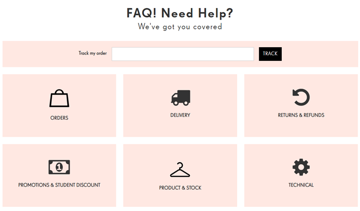
How to build Help Center looking like this?
How to add/make the buttons work?
The required feature is active buttons. It is an example taken from whatever web.
0
8
8 comentarios
Brett Bowser
Hey Juste,
I recommend taking a look at the following articles for some guidance on Help Center customization:
I'll also leave this post open in case others want to jump in here and offer up some solutions.
If you prefer to have this set up for you, we do have a professional services team available that can help at an additional cost. Let me know if this is something you're interested in and I can connect you with your account manager :)
Cheers!
0
Lotus Themes, Zendesk partner for Help Center design and customization
Hi Juste,
Brett is right, this help center customization requires coding. And this is actually what we specialize in :) as a Zendesk partner. We'll be happy to help you. Feel free to reach out to us.
Best regards,
Lotus Themes
1
Diziana
Hey Juste
You can try this code for your given template design , I edit this code at default Copenhagen theme .
Step 1 : At home.hbs page you have to remove these all code from line no - 1 to 5
And paste below code :
Step 2 : At script.js page you need to add this code bottom of the page :
$("form.search input[type=submit]").attr("value", "TRACK");Step 3 : At home.hbs page copy below code :
<a href='{{url}}' class="blocks-item-link">
<div class="icon">
{{#is name 'Using Guide'}}
<i class="fas fa-book "></i>
{{/is}}

{{#is name 'Business Rules'}}
<i class="fas fa-file-contract"></i>
{{/is}}

{{#is name 'Configuration'}}
<i class="fas fa-cogs"></i>
{{/is}}

{{#is name 'Using Support'}}
<i class="fas fa-headphones-alt"></i>
{{/is}}

{{#is name "JUST GET STARTED?"}}
<i class="fas fa-power-off"></i>
{{/is}}

{{#is name 'Getting Started'}}
<i class="fas fa-play-circle"></i>
{{/is}}
</div>
And replace line no. 26
Step 4 : At document.hbs page you need to add this font awesome icons library :
Step 5 : At style.css page you have to edit the code carefully :
first : line no. 732 - remove background-image property
And apply this background-color property :
.hero{background-color: #f8dfdf;
}
Second : Line no 689 - remove border-radius :
Step 6 : Copy below code and paste it at bottom of style.css page :
.blocks-item {
  border: 1px solid #f8dfdf;
  background-color: #f8dfdf;
  padding: 10px 0;
}

.blocks-item h4 {
  color: #000000 !important;
}

.blocks-item i.fas {
  font-size: 40px;
  margin-bottom: 10px;
  color: #000000;
}

.search {
  width: 100%;
  display: flex;
}

.hero {
  background-color: #f8dfdf;
  height: 100px;
}

.hero-inner {
  display: flex;
  max-width: 710px;
}

.hero-inner p {
  width: 30%;
  margin: 9px 0;
}

.header-text h1,
.header-text h3 {
  text-align: center;
  margin-bottom: 0;
  font-family: 'Dosis', sans-serif;
  font-weight: 500;
}

.header-text h3 {
  margin-bottom: 30px;
}

.hero-inner input[type="submit"] {
  background-color: #000000;
  min-width: 90px;
  margin-left: 11px;
  height: 40px;
  border-radius: 0;
}

.hero-inner input[type="submit"]:hover {
  background-color: #0000008c;
}

.search::before {
  display: none;
}
second : At style.css page you need to edit font family in body tag line no - 10 :
I selected 'Donis' , sana-serif .
You can choose as per your requirements go to the google font website - https://fonts.google.com/
and choose any font-family.
Now you can see -
Thank You.
0
Sabrina Kwok
Hello Ifra!
I have some articles that are video-oriented, while some articles are more text-based.
Currently, ALL contents are using the article icon under the article list item. See below.
I know how to change the article icon. Simply change it from \f0f6 to another code like \f03d . However, this will affect all articles. This is not quite what I want.
I want to have the option to choose between 2 types of content, i.e. video and text, when I started drafting the articles. Once I selected the article is a video-oriented content, it will auto-use and generate the icon (\f03d). On the other hand, when I choose text-based content, it will auto-use the icon (\f0f6).
I suppose it is restricted by the article-item class currently. I know I need to create more classes for different icons, and then in the hbs page refer to the specific class.
Just that I am no code writer/ editor, so I don't quite know how and what I should do.
0
Ifra Saqlain
Hey Sabrina,
You can add a class for video-article on section_page.hbs and add different-different icons for text-articles and video-articles.
See, how can you add class name for video-articles.
On your section page -
See line no. 44
I replaced that line with some code snippets, see in the given image.
Copy the given code and replace the line no. 44.
NOTE : {{#is id 360040946414}} href="/hc/en-us/articles/360040946414-Video" class="video-link" {{/is}}  , look on bolded text.

{{#is id 360040946414}} - it's your video-article ID.

href="/hc/en-us/articles/360040946414-Video"  -  it's your URL of video-article.

class="video-link" - It's new class name only for video articles and I use this class name for
adding video icon.


you have lots of video articles then you can add class name for every article just like this.
I added only in two articles.
When your video-articles isn't showing then automatically video icons would be hide and
when you text article would be hide then icon also would be  hide automatically.
Now I added the icon for video-artice list - Stylesheet
.video-link::before{content:"\f0f6";
}
See the result -
If any issue please let me know :)
Thank you
Team Diziana
0
Sabrina Kwok
Brilliant!! :D
Thanks a bunch, Ifra!
0
Sydney Neubauer
We have buttons on the home page and when you click into a button (category) it takes you to section page which is also buttons. We are wanting to make the sections inside a section to have buttons with the description that the section has (Category(button)>Section(button)>Section(link currently but want to make a button))
Is that possible?
0
Jakub
You can achieve this by customizing your section template:
Guide Admin > Themes > Customize > Edit code and locate the element you want to include the button in. This would be the element for subsections:
0