最近搜索
没有最近搜索
Creating a 100% Stacked Bar Chart
已回答

已于 2019年4月16日 发布
Hello,
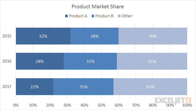
I'm trying to set up a stacked bar chart where every column/row adds up to 100%, in order to visualize proportions. I want to compare the percentage of tickets we get by Product Module (custom field of ours). However, I can't find any options to do so, neither in x-axis nor y-axis options in the Chart Configuration sidebar. See below for an example.
Any help would be appreciated!
0
6
6 条评论
正式
Philippa Booth
Hi Chen
Check that all the results for the attributes you have on rows are selected - otherwise you might be missing one or two! This can happen if new results appear in the dataset after the query is set up and the selection made. You can fix it in the chart configuration menu, row selector section, where you can show and hide the selector, and also specify that you always want it to show all values using the 'selected position' menu.
Hope that helps - if it doesn't explain the situation, send us in a ticket so we can have a look at what is going on.
Philippa
0
Greg Katechis
Hi Josue!
You can do this by going to the Chart Configuration icon (it's a paintbrush) and then select "Chart" and set the values like this:
After you've done that, you'll go to "Display values" and set it like this:
After you've set up your date values as a column and your ticket field as a row (along with your metric), you should have something that looks like this:
Note that I had a very low volume of tickets that showed useful numbers, but hopefully this is what you're looking for!
0
Carolyn Chassaigne
I'm also experiencing this issue when looking at % one-touch tickets, % two-touch tickets, % multi-touch tickets by week. I'm not seeing a way to have this be a 100% stacked chart as it's showing the weekly ticket count as the X axis. Any ideas?
0
Jeremy Heath
Is there a way to get the total figure inside the metric so it says 24 Tickets for e.g. ?
As you can see this looks rubbish unless im doing something wrong
0
Eugene Orman
@Carolyn, I suggest to use the Tickets solved metric with the Agent replies brackets attribute instead of the % metrics for your set up. It will allow creating a chart like this:
 Demo: https://cl.ly/82d547114a38
@Jeremy, it is not possible to adjust the position of the total values yet. That's why white is not the best color for the values if you are using the totals option. Try using another color.
0
Philippa Booth
Hi Josue
You can change the presentation of numbers, eg from number of tickets to % of total, using a result path calculation, from our result manipulation menu
In your example, you would set the query up with the product on 'rows', so you need to specify this as the 'path' in the settings - see screenshot.
Philippa
2