When you create a report in analyst copilot, you can choose from a range of visualization types that control how it appears. This article explains how to change the report visualization and provides a reference to the available visualization types.
For help on creating reports and changing visualization types, see Creating reports in analyst copilot.
Analyst copilot reports support the following visualization types:
| Visualization type | Description | Uses |
|
Area
|
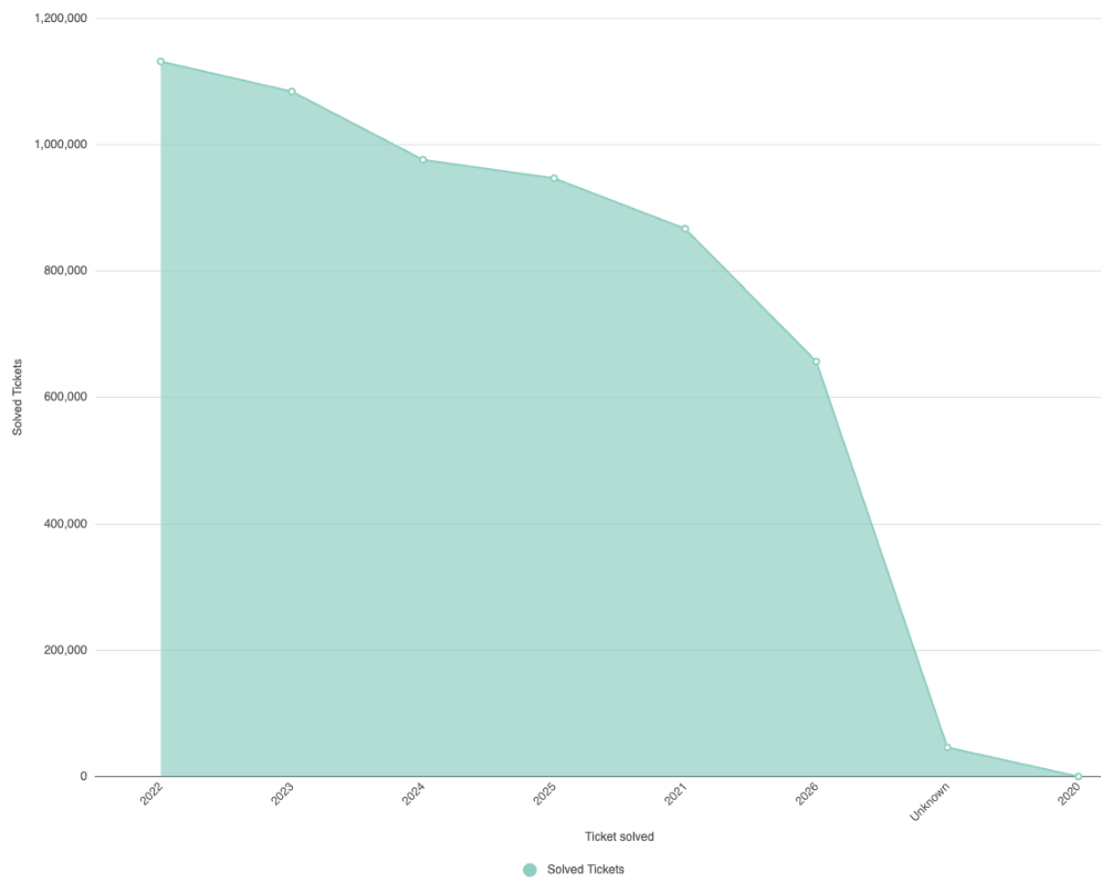
Displays data points (often time-based) along an X-axis, and a Y-axis, such as counts or sums. The points are connected by a line, and the area below the line is shaded, helping you see overall trends and total amounts over time, such as ticket volume or sales. A simple area chart shows just one series, such as total tickets per month, and visualizes overall growth. A stacked area chart displays multiple series, such as tickets from different support channels so you can see both each group’s contribution and the total trend over time. |
|
|
Bar
|
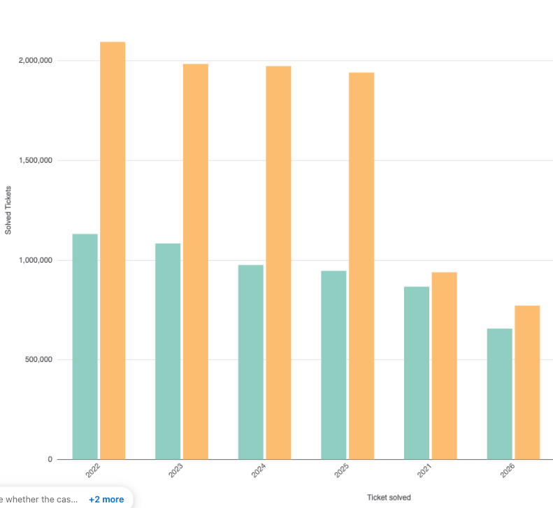
Displays data using rectangular bars, where the length of each bar represents the value of the data for a specific category. In a bar chart, categories are typically displayed on the Y axis (for horizontal bar charts) and metrics (values) are shown on the X axis. |
|
|
Chord
|
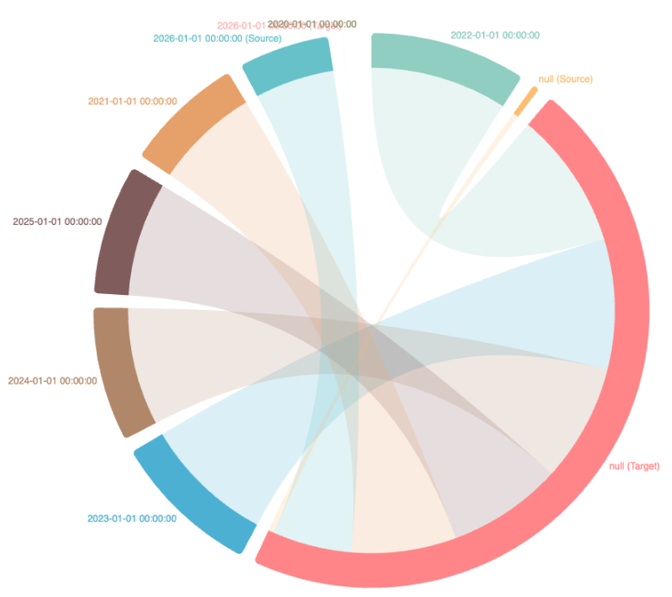
Displays entities (such as teams, regions, article topics, or departments) on the edge of a circle. Each curved line, also called a chord or ribbon, spans from one entity to another, indicating an interaction or flow (for example, traffic, shared users, or resource exchange). The thickness of each chord visually communicates how significant that link is compared to others. |
Chord charts are less suited for presenting time series, exact values, or datasets with a very large number of categories, where visual clarity may suffer. |
|
Combo
|
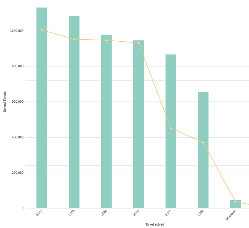
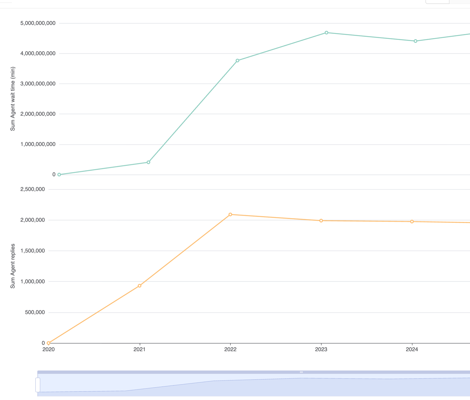
Combines two or more chart types, most commonly bars and lines, into a single view. This allows you to display multiple metrics, even those with very different value ranges (like revenue and ticket volume), on the same chart. By using both a primary and a secondary Y axis, you can make each metric quickly comparable and visually distinct, making it easier to compare data within a single report. Combo charts require at least two metrics to display. |
|
|
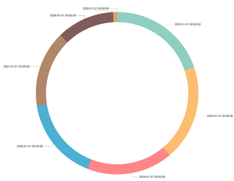
Donut
|
A variation of a pie chart that displays data as proportional segments of a circular ring, rather than a filled circle. Each segment represents a category’s value in relation to the whole, making it easier to see the composition and share of each part. |
Donut charts are not recommended when you have many small, similarly-sized categories, or when you need to compare values in detail. Bar charts or tables are better for those scenarios. |
|
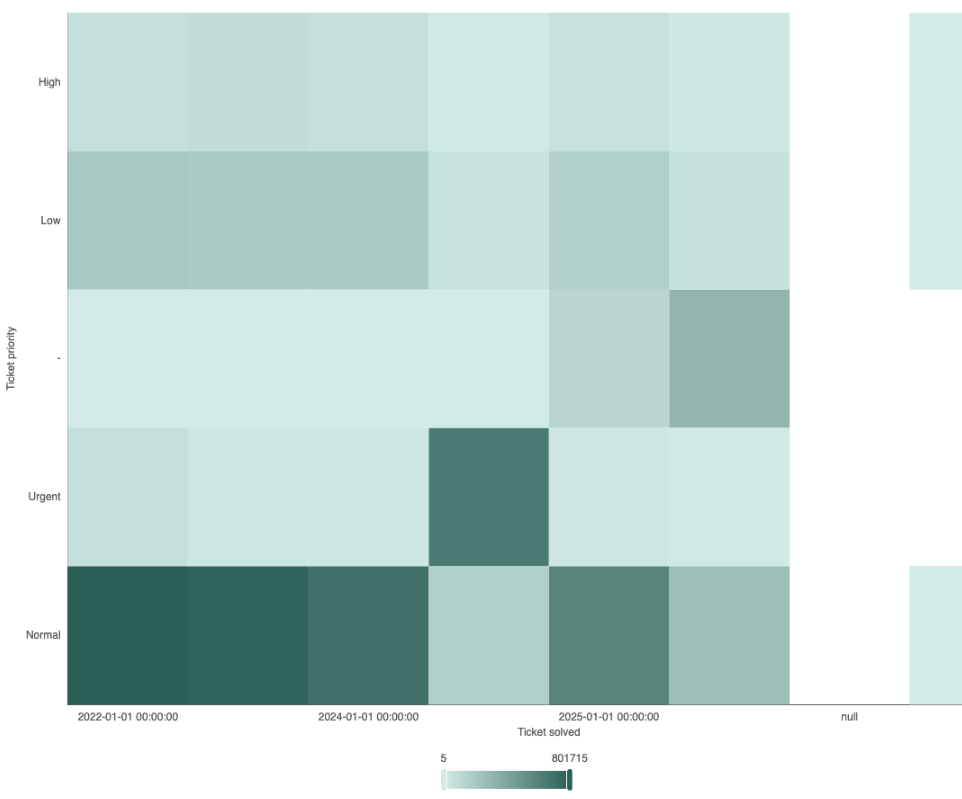
Heatmap
|
Visualizes quantitative values using a matrix of colored cells. Each cell’s
color intensity reflects the magnitude of the value at that position. For example, in analyst copilot, a heatmap might show ticket creation counts, where the X-axis is days of the week, the Y-axis is hours, and cell color indicates ticket volume. Darker or more saturated colors represent higher values, while lighter colors indicate lower values. |
|
|
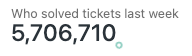
KPI (Key Performance Indicator)
|
A value that indicates how effectively an organization, team, or individual
is achieving a critical business objective. KPIs are used to evaluate success at
reaching specific targets and inform decision-making, operational improvements,
and strategic priorities within a company. Examples include metrics like customer satisfaction score (CSAT), first response time, ticket volume, sales conversion rate, or system uptime, each tied to a business goal or expected outcome. |
|
|
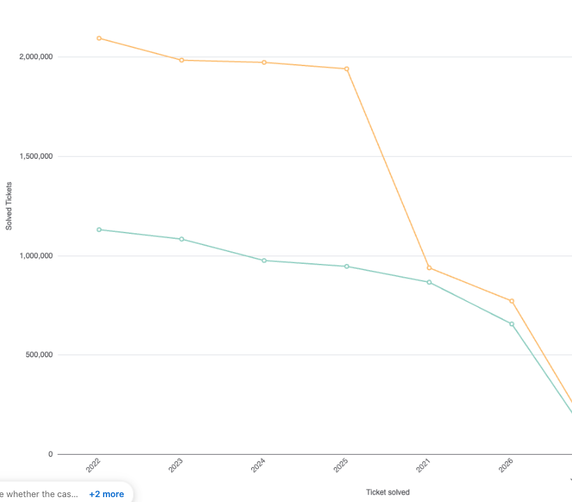
Line
|
Represents how metric results change over time or another continuous dimension. It displays data points connected by straight or curved lines, making it ideal for visualizing trends, patterns, or changes in values over a period. |
|
|
Network
|
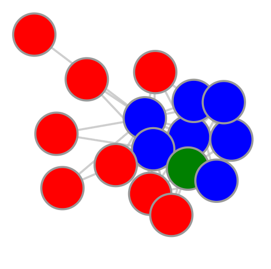
Shows how different things (like teams or systems) are connected. Each dot is a node, and lines (called edges) show how they are linked or depend on each other. This helps you quickly see clusters, spot the most important nodes, and understand how everything fits together. |
|
|
Radar
|
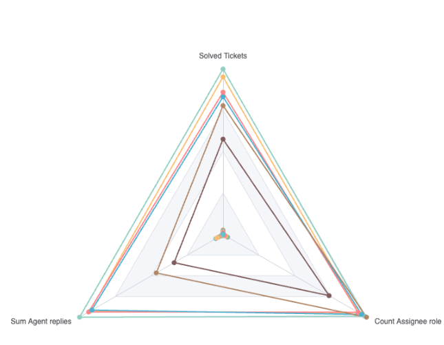
A radar chart, also known as a spider chart, is designed to display multivariate data across at least three metrics, where each metric is represented as an axis radiating from a central point. Each data group is plotted across these axes and connected to form a polygon, often with lines of different colors representing additional groupings or categories. |
|
|
Sankey
|
A flow visualization that illustrates how data, resources, or values move
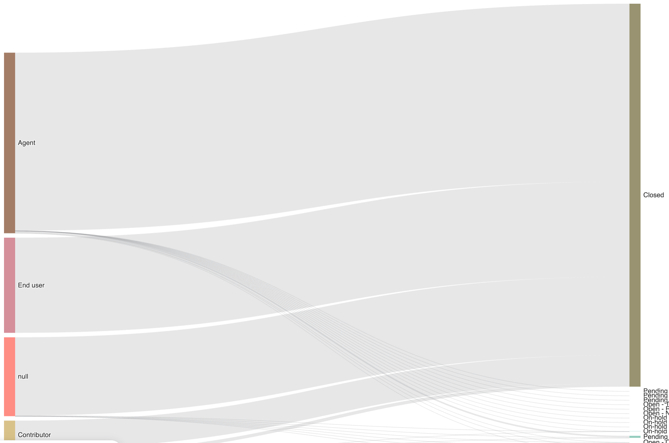
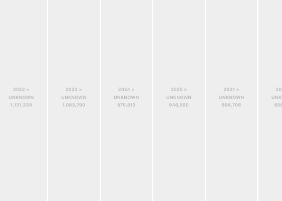
between different categories or stages. Each node in the diagram represents a category or step in a process, while the links (arcs) connecting nodes show the flow between them. The width of each link is proportional to the amount or magnitude of the flow it represents, offering a direct visual representation of the volume moving through various paths. |
|
|
Scatter
|
Plots pairs of numerical values, where each axis represents a different
metric or variable. By evaluating the distribution of points, you can identify
potential correlations (positive, negative, or none), groupings, or anomalies
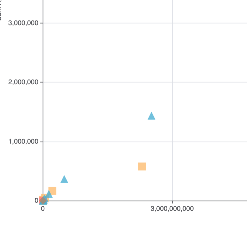
across your dataset. Unlike line charts or bar charts, scatter charts do not connect the points or aggregate over categories, they map every data pair, providing a direct view of distribution and relationships. |
|
|
Table
|
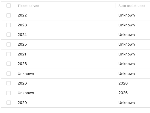
Organizes information into rows and columns, similar to a spreadsheet, making it easy to display detailed records and compare values across multiple categories or attributes. Each row typically represents an individual item or record, while each column displays a specific metric or attribute for those items. A table helps you to break down data (such as ticket volume, CSAT, or chats by country) into straightforward tables for easy analysis. |
Table charts are best suited for displaying categorical, granular, or high-detail data where other chart types (like a bar or line graph) would be too cluttered or imprecise. |
|
Timeline
|
Arranges events in chronological order, often showing each event as a
marker (dot, icon, or bar) positioned along a time axis. Events can represent
instantaneous points in time (like a ticket being opened) or durations (like a
deployment window or scheduled outage). Timeline charts display these events or periods above and below the central time axis, often with labels or descriptions attached. |
|
|
Toggle
|
Allows you to switch between different grouped or segmented views of the
data using a UI control directly on the chart or dashboard widget. Analyze the
same metric across multiple groupings by switching between categories such as
brand, group, or status, without building separate reports or charts for each
view. Once you've selected the data you want, click Drill into selection. Analyst copilot adds a new filter that restricts the report to only the items you selected. |
|
|
Treemap
|
Displays hierarchical data using nested rectangles, where the size of each
rectangle is proportional to a specific value or metric. Treemaps are helpful
for comparing multiple categories and subcategories at once, allowing you to see
both the overall distribution and the largest (or smallest) contributors in a
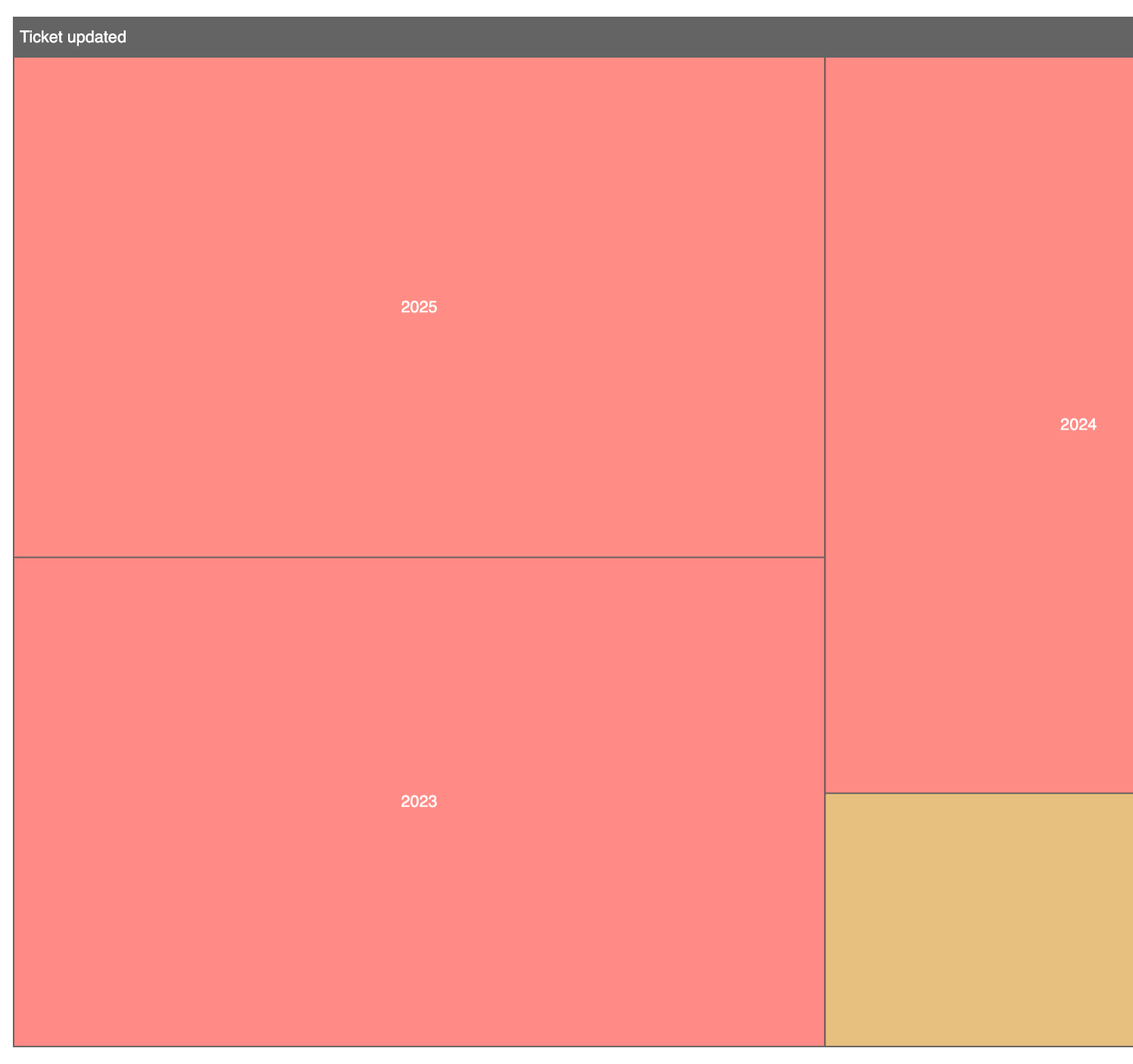
single compact visual. In a treemap, each higher-level category contains smaller rectangles representing its subcategories. The larger the value, the bigger the rectangle. When you hover over or click a rectangle, you can see more detailed information. |
|
|
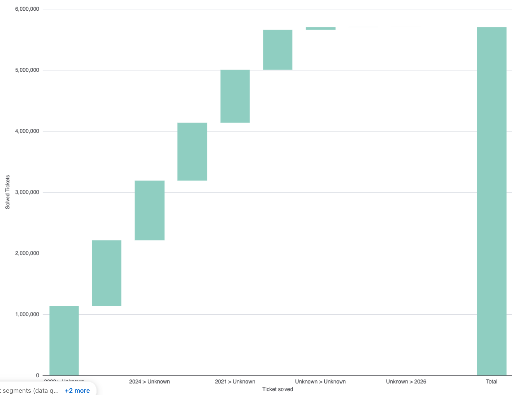
Waterfall
|
A waterfall chart visually represents a sequence where each bar indicates
an increase or decrease from the previous total. The chart begins with a starting value (often called the baseline), then shows a sequence of additions (positive changes) and subtractions (negative changes), typically as floating bars, before arriving at the final total (ending value). Connector lines are often used to “bridge” these bars together, reinforcing the idea of a running sum. |
Waterfall charts are less suited for visualizing trends over long periods or when you need to compare many series at once; other chart types like line, area, or column might be better for those cases. |