When you want to look at result trends over time, charts with a left to right progression are a good choice to give a sense of flow.
Line
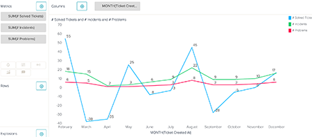
A line chart is the best option for looking at a detailed time series or for adding trend lines. If you add a trend line to a line chart, the trend line will appear in the same color as the metric it represents. You can add trend lines either in Chart configuration > Trend line or when you add a new metric (see Adding metrics on a trend line).
When you select a line chart, you can change the following options in the chart
configuration menu ( ):
):
- In Chart, you can choose whether and when to show the grid (Show grid), edit the shape of your lines (Curve), change the width of your lines (Stroke width), insert approximations in the place of null values (Interpolate missing values), choose not to replace null values (Do not replace missing values by zero), represent result points with different shapes (Point renderer), and show metric aggregators in datatips (Show aggregators).
- In Colors, you can change the grid, background, and line colors.
- You can change the style, text, and position for X and Y axis.
- If you placed a metric on a dual axis, you can edit the secondary axis settings in Secondary axis (see Adding metrics on a dual axis).
Column
A column chart is useful when the time series does not have many results, for example annual results over a short period. Column charts also enable you to stack results, so you can easily compare metrics for each category.

When you select a column chart, you can change the following options in the chart configuration menu:
- X, Y, and secondary axis have the same customization options as line charts.
- In Colors, you can edit the grid and column colors. You can also choose to display your chosen colors as gradient colors.
- In Chart, you can select Stacked to view metric results in the same
column, rather than side-by-side. After you check the Stacked box, you can edit
the settings for how your results are stacked.

If you want to view an attribute values as stacked, you can add the attribute to the Rows panel and select all of the attribute values in the row selector. You must also add an attribute to the Columns panel if you want your results to render properly.
Area
Similar to a line chart, area charts use lines to track results. Area charts also shade underneath the line to demonstrate the weight of the results.

):- X, Y, and secondary axis have the same customization options as line and column charts.
- In Colors, you can edit the line and shading colors.
- In Chart, you can edit the opacity of the shaded areas, insert missing values, or represent result points with different shapes. You can also change the shape of the line and stack results. If you select Stacked, your metric results will automatically appear on top of each other.
Sparkline
Sparkline charts display time in a different way than the other trends over time charts. The sparkline chart highlights key values like the last value to date, the lowest value, the highest value, and whether the trend is decreasing or increasing across the time period.
The sparkline chart will also display a simplified representation of the report in your chosen chart type. You can hover over points in this smaller chart to see the attribute and metric results. The sparkline chart will only take into account the first metric added to Metrics and the first attribute added to Columns. However, you can divide the results further by adding attributes to Rows.
In the example below, Tickets is added to Metrics, Month is added to Columns, and Ticket Type is added to Rows.

- In Colors, you can edit the text color, the point colors, and each of the column colors.
- In Chart, you can select whether to hide or show columns, bandlines, and values.
- You can also select the type of chart, by choosing a new type from the Visualization type drop-down list in Chart.