Summary: ◀▼
Use the team performance dashboard in analyst copilot to track agent efficiency and customer satisfaction with tickets. You can review solved tickets, reply and resolution times, requester wait time, group and assignee activity, and CSAT scores. Filter reports by date, group, assignee, brand, channel, form, or organization to spot trends and compare team performance.
Analyst copilot features a prebuilt dashboard to help you evaluate the efficiency of your agents and customer satisfaction with their tickets.
This article contains the following topics:
Accessing the Support: Team performance dashboard
You can access the Support: Team performance dashboard from the analyst copilot home page using the following procedure:
To access the Support: Team performance dashboard
- In Analytics, click the analyst copilot
icon (
 ).
). - On the analyst copilot home page, search for, then click Support: Team
performance.
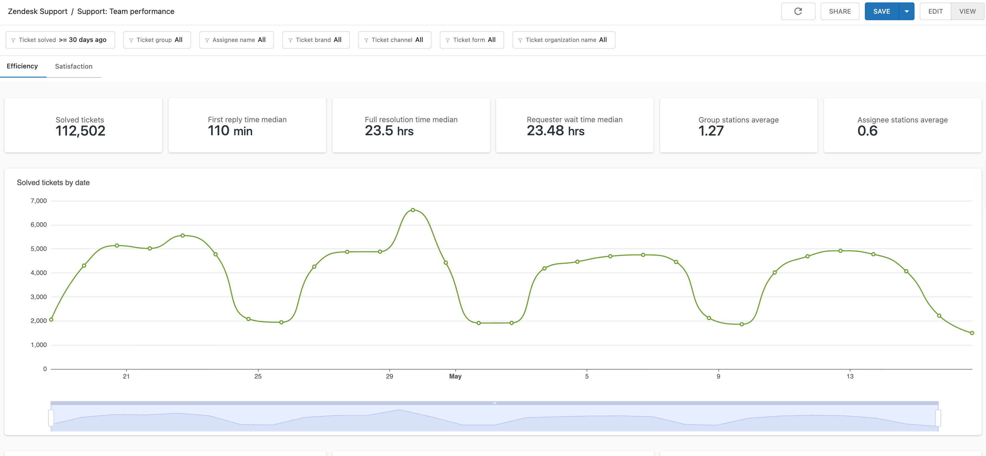
The dashboard opens on the Efficiency tab.
Understanding the Support: Team performance dashboard reports
The Support: Team performance dashboard contains the following tabs:
- Efficiency: Contains reports that help you analyze how many tickets are being solved, and how quickly.
- Satisfaction: Contains several reports that help you track customer satisfaction with their submitted tickets.
All reports can be filtered by ticket solved date, ticket group, assignee name, ticket brand, ticket channel, ticket form, and ticket organization name.

Understanding the efficiency tab reports
The efficiency tab contains the following reports:
Efficiency tab headline metrics
This tab displays the following headline metrics (KPIs):
- Solved tickets: The total number of tickets solved.
- First reply time median: The median time from when the ticket was first created until an agent first replied.
- Full resolution time median: The median time from the creation of a ticket until it was closed or solved.
- Requester wait time median: The median time that tickets spent in the new, open, or on-hold status.
- Group stations average: The average number of groups a ticket was assigned to.
- Assignee stations average: The average number of agents a ticket was assigned to.

Efficiency tab reports
The Efficiency tab contains the following reports:
-
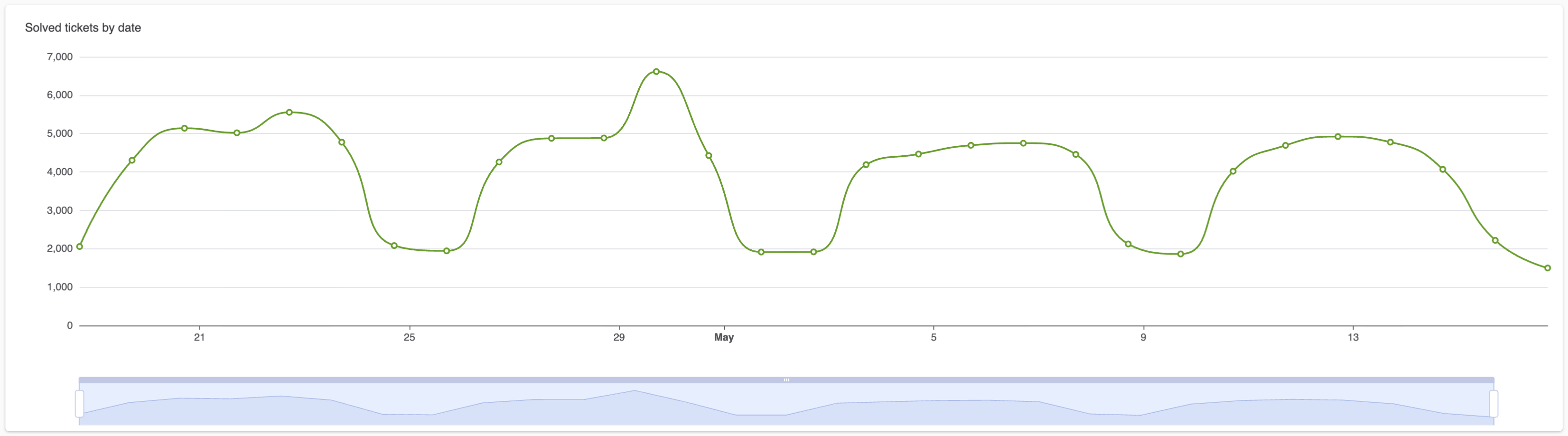
Solved tickets by date: A line chart displaying the number of
tickets solved over the selected date range.
-
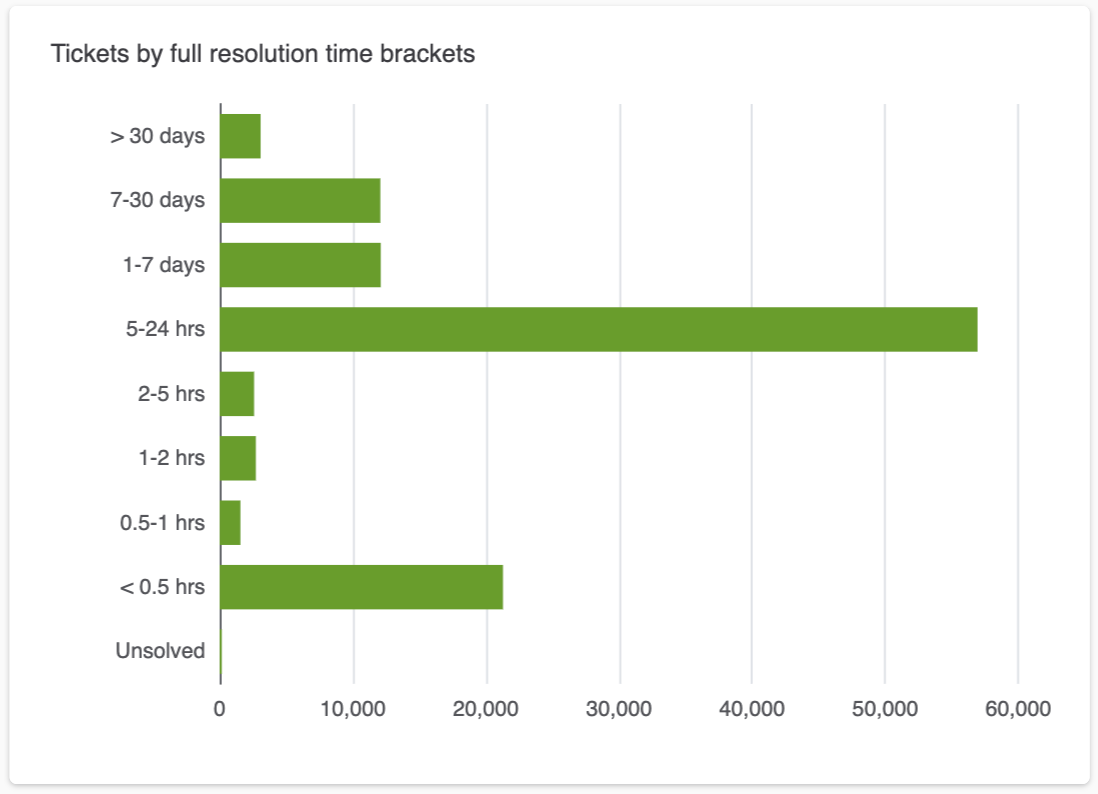
Tickets by full resolution time brackets: A bar chart displaying
full resolution times for tickets bracketed by various time
periods.
-
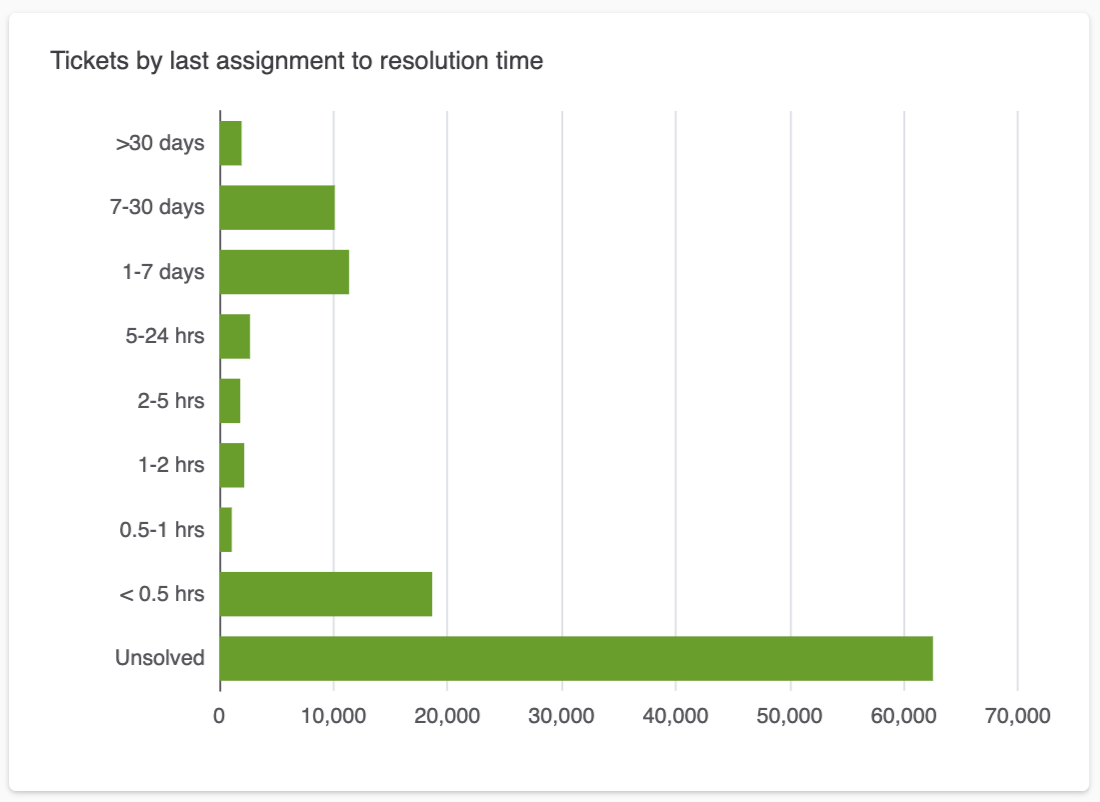
Tickets by last assignment to resolution time: A bar chart
displaying times from the last assignment to when they were resolved for
tickets bracketed by various time periods.
-
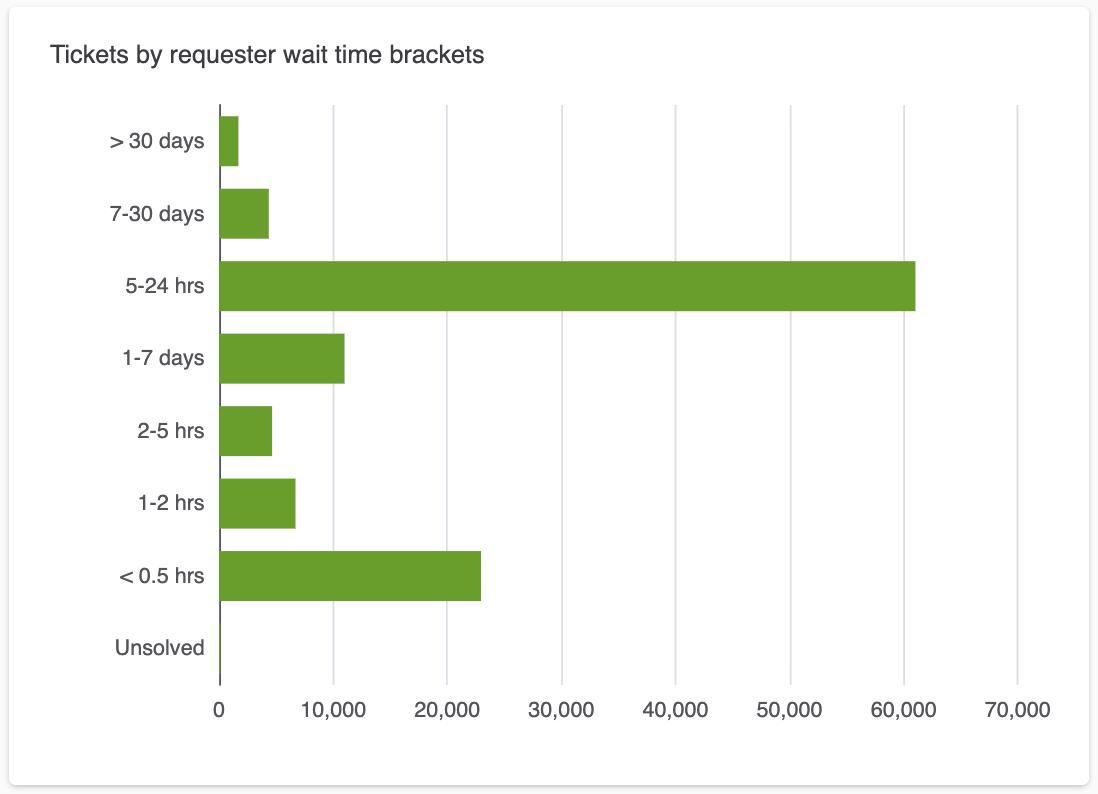
Tickets by requester wait time brackets: A bar chart displaying
the time that tickets spent in the new, open, or on-hold statuses
bracketed by various time periods.
-
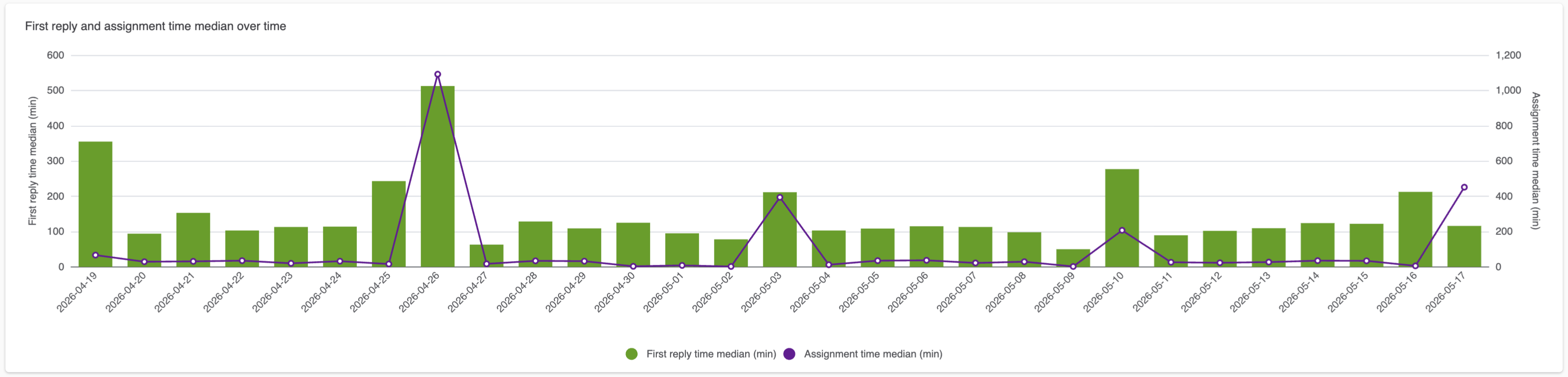
First reply and assignment time median over time: A column chart
that compares the median first reply time and the median first
assignment time over the date range you select.
-
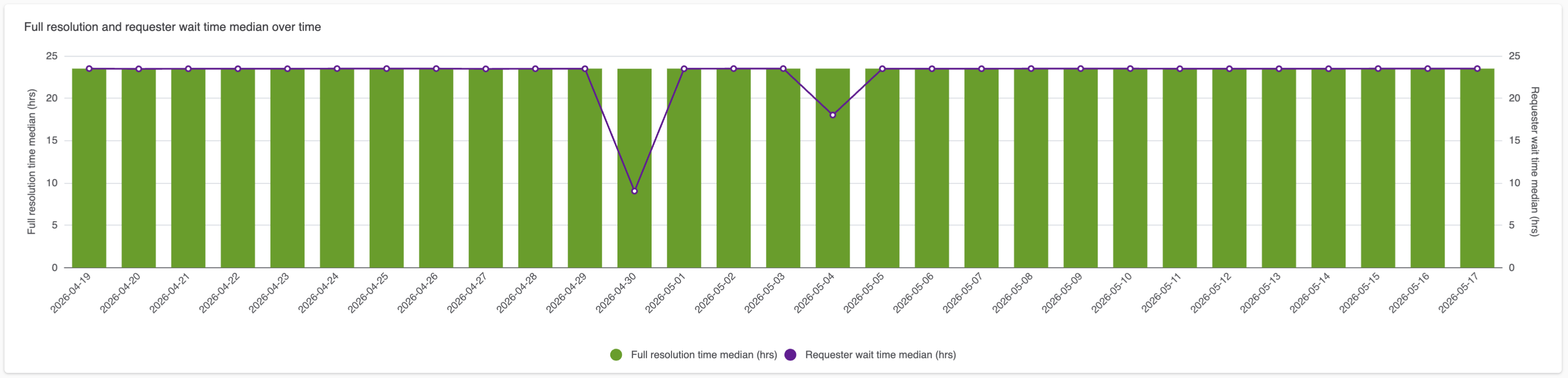
Full resolution and requester wait time median over time: A
column chart that compares the amount of time it took to solve a ticket,
and the median time a ticket spend in the new, open, or on-hold status.
over the date range you select.
-
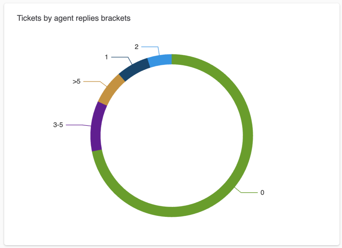
Tickets by agent replies brackets: A donut chart displaying the
bracketed percentage of agent replies for tickets.
-
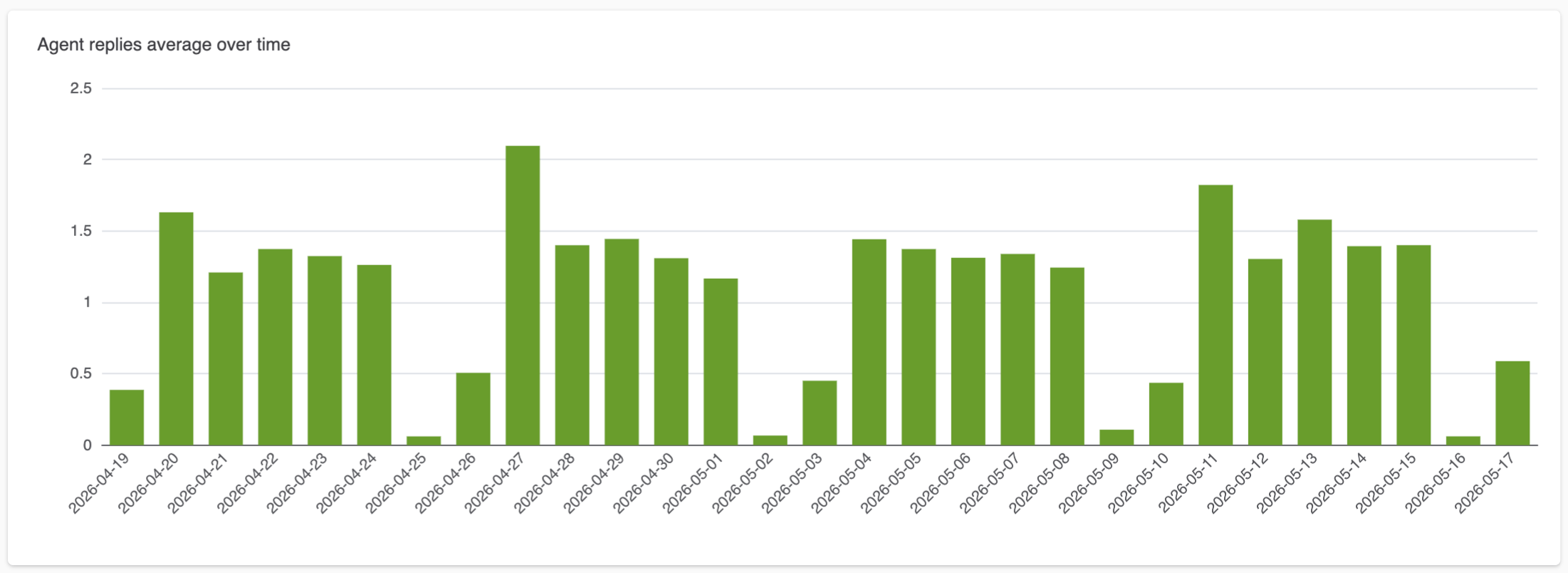
Agent replies average over time: A column chart displaying the
average number of agent replies and the total number of tickets solved
on a daily basis. You can hover over a data point to see the exact
results for a day.
-
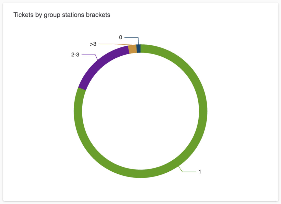
Tickets by group stations brackets: A donut chart displaying the
number of groups that tickets were assigned to.
-
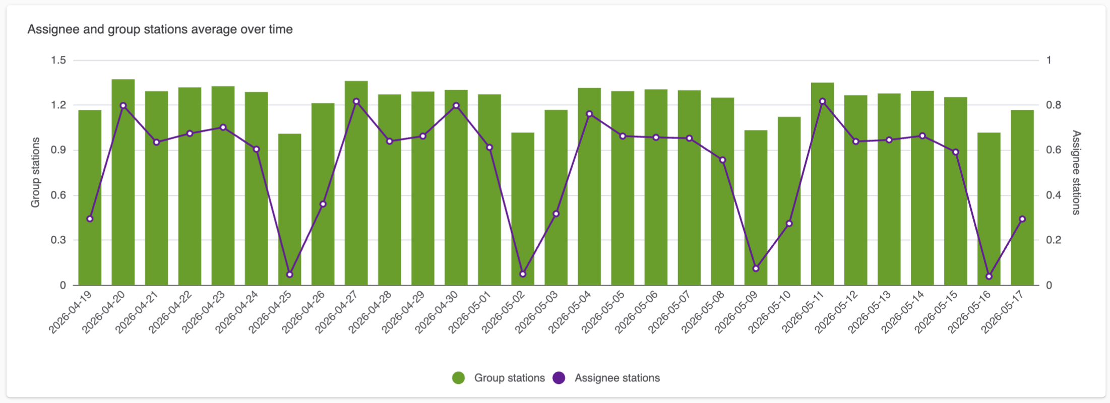
Assignee and group stations average over time: A column chart
displaying the average number of tickets that were assigned to agents
and the average number of groups associated with each ticket.
-
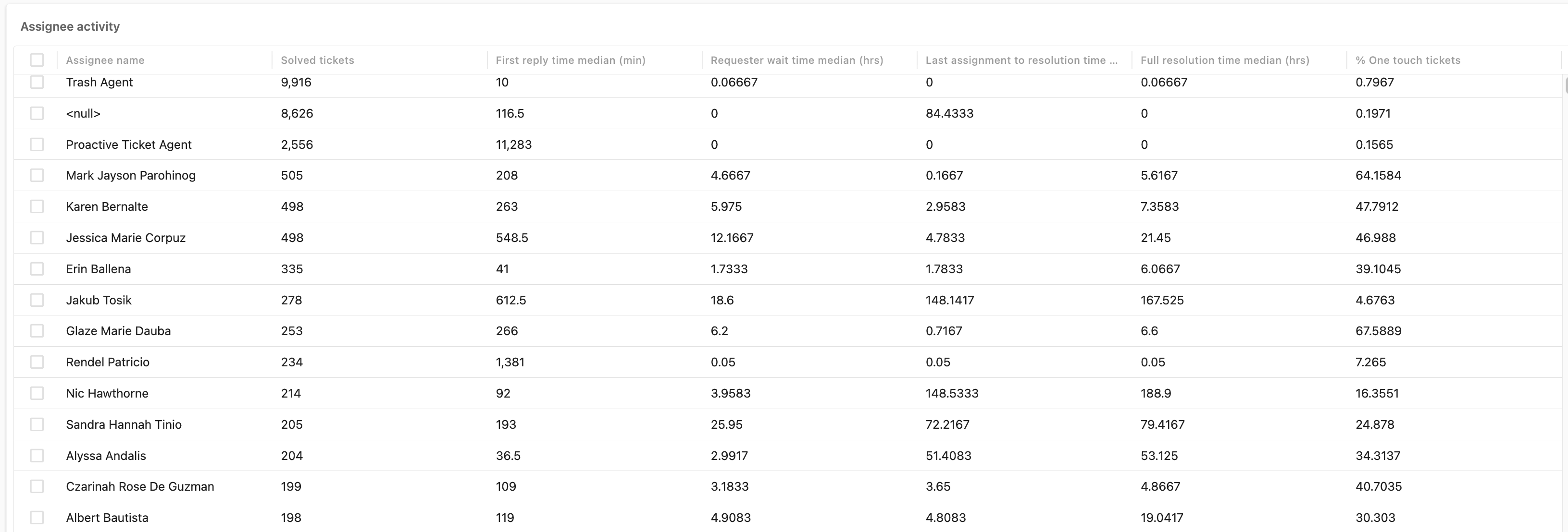
Assignee activity: A table displaying your agents and their
activities including the number of tickets they solved, and reply
times.
-
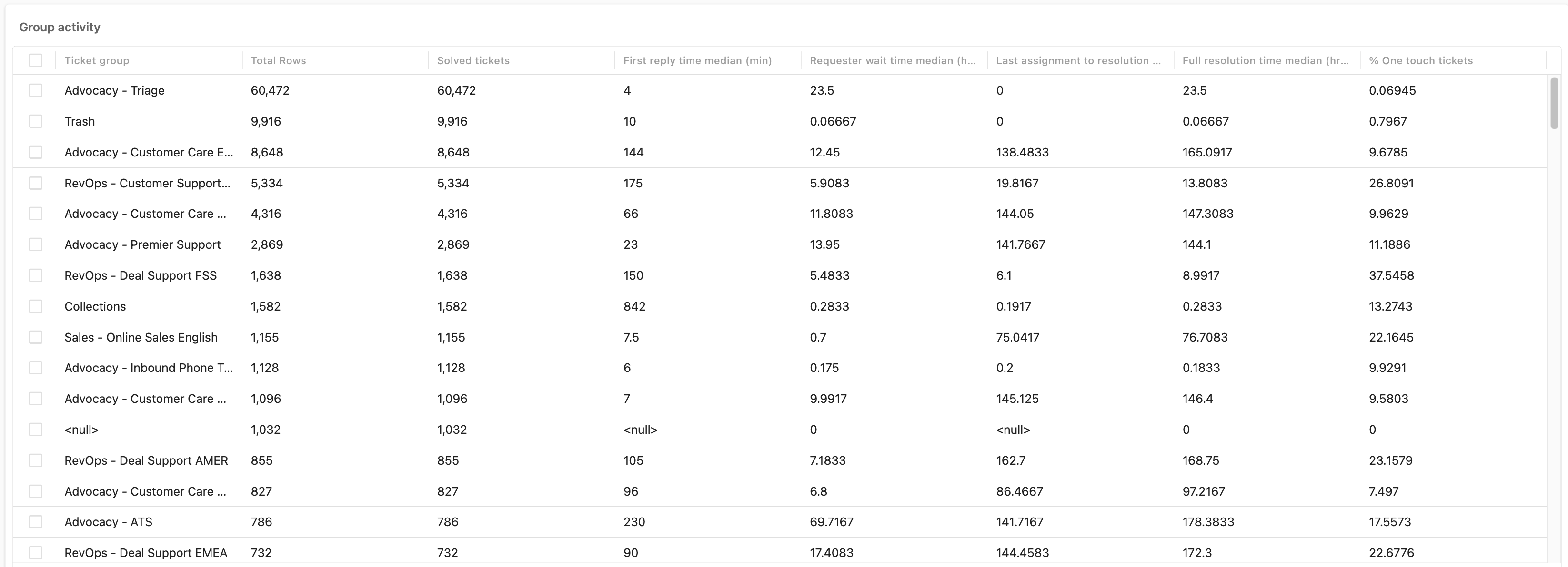
Group activity: A table displaying your ticket groups and their
activity including total tickets, solved tickets, and resolution
times.
Understanding the Satisfaction tab reports
The satisfaction tab helps you take a closer look at customer satisfactions (CSAT) scores for your tickets.
Satisfaction tab headline metrics
The satisfaction tab contains the following headline metrics (KPIs):
- Satisfaction score: The percentage of tickets rated as good from the total number of rated tickets.
- Good satisfaction tickets: The number of tickets rated as good.
- Bad satisfaction tickets: The number of tickets rated as bad.
- Satisfaction rated ration: The percentage of tickets that received either good or bad from the total number of surveyed tickets.

Satisfaction tab reports
The satisfaction tab contains the following reports:
-
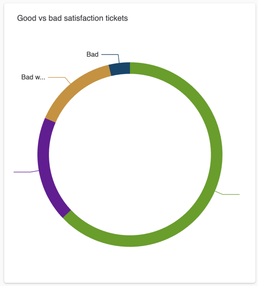
Good vs bad satisfaction tickets: A donut chart displaying the
number of good and bad satisfaction rated tickets both with and without
comments.
-
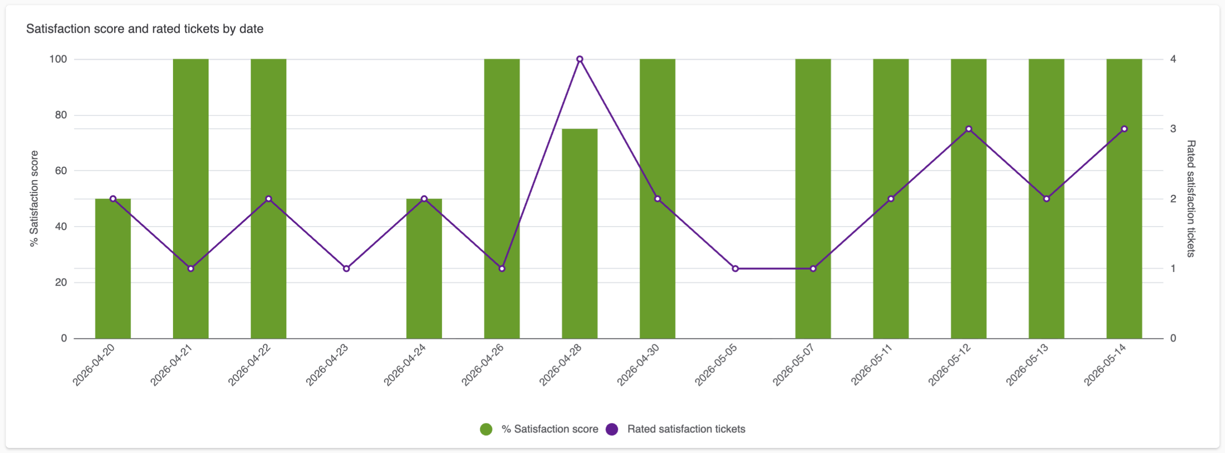
Satisfaction score and rated tickets by date: The number of rated
tickets against the percentage satisfaction score they received over the
selected date range.
-
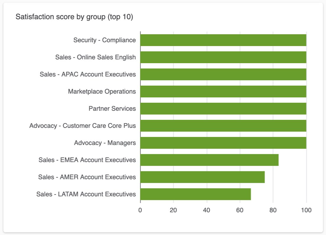
Satisfaction score by group (top 10): A bar chart displaying the
top 10 groups by satisfaction score.
-
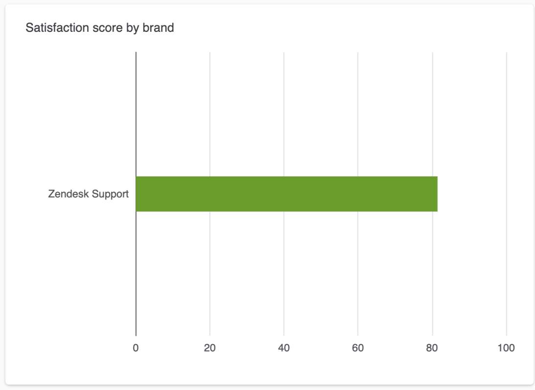
Satisfaction score by brand: A bar chart displaying the top 10
brands by satisfaction score.
-
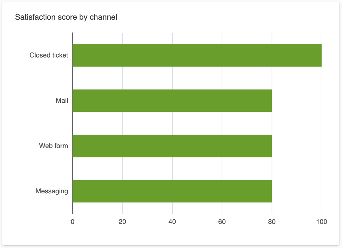
Satisfaction score by channel: A bar chart displaying your ticket
channels by satisfaction score.
-
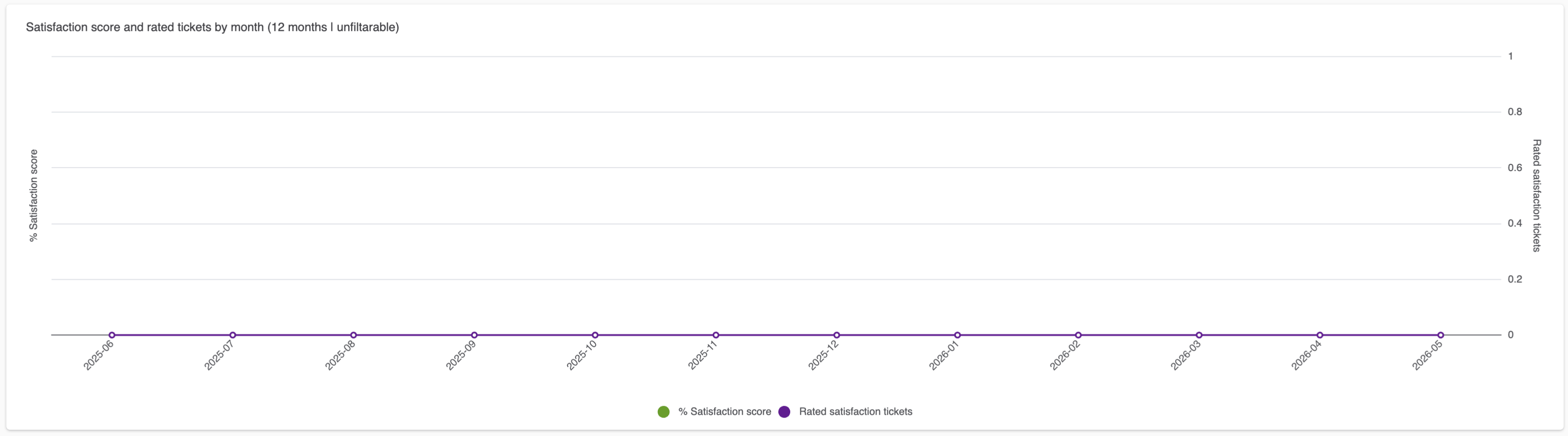
Satisfaction score and rated tickets by month (12 months
unfilterable): A line chart displaying the number of rated
tickets against the percentage satisfaction score they received over the
last 12 months.