How do I show articles **before** subsections in a section template?

Publicado 11 de jun. de 2021
I want to display the **articles** that are in a section **before** the subsections. I tried rearranging the {{#if section.articles}} and {{#if section.sections}} in the section-template (see below), but it didn't seem to make any difference...
CODE:
<section class="breadcrumb-wrapper">
<div class="container breadcrumb-container border-bottom">
<nav class="breadcrumb-nav">
{{breadcrumbs}}
</nav>
</div>
</section>
<section class="content-wrapper section-content-wrapper">
<div class="container section-content-container">
<header class="page-header content-header">
<h1 class="content-title section-title">
{{section.name}}
{{#if section.internal}}
<span class="icon-lock" title="{{t 'internal'}}"></span>
{{/if}}
</h1>
{{#if settings.show_follow_section}} {{subscribe}} {{/if}}
</header>
{{#if section.description}}
<p class="page-header-description">
{{section.description}}
</p>
{{/if}}
{{#if section.articles}}
<ul class="article-list">
{{#each section.articles}}
<li class="article-list-item {{#if promoted}} article-promoted{{/if}}">
<a href="{{url}}" class="article-list-link collapsible-title" title="{{title}}">
<span>
{{#if promoted}}
<span data-title="{{t 'promoted'}}" class="icon-star">
</span>
{{/if}}
{{title}}
</span>
<img src="{{asset 'plus-icon.svg'}}" onerror="this.src={{asset 'plus-icon.png'}};this.onerror=null;" alt="plus-icon" class="close"/>
<img src="{{asset 'minus-icon.svg'}}" onerror="this.src={{asset 'minus-icon.png'}};this.onerror=null;" alt="minus-icon" class="open"/>
</a>
<p class="article-body collapsible-body">
{{excerpt body characters=250}}<br/>
<a href="{{url}}" class="view-more btn" role="button" title="{{t 'see_more'}}">
{{t 'see_more'}}
</a>
</p>
</li>
{{/each}}
</ul>
{{else}}
<i class="section-empty">
<a href="{{section.url}}" title="{{t 'empty'}}">
{{t 'empty'}}
</a>
</i>
{{/if}}
{{#if section.sections}}
<ul class="section-list section-list--collapsed">
{{#each section.sections}}
<li class="section-list-item">
<a href="{{url}}">
<span>{{name}}</span>
<svg xmlns="http://www.w3.org/2000/svg" width="16" height="16" focusable="false" viewBox="0 0 16 16" aria-hidden="true">
<path fill="none" stroke="currentColor" stroke-linecap="round" stroke-width="2" d="M5 14.5l6.1-6.1c.2-.2.2-.5 0-.7L5 1.5"/>
</svg>
</a>
</li>
{{/each}}
<a tabindex="0" class="see-all-sections-trigger" aria-hidden="true" id="see-all-sections-trigger" title="{{t 'see_all_sections'}}">{{t 'see_all_sections'}}</a>
</ul>
{{/if}}
WHAT I SEE ON SECTION PAGE: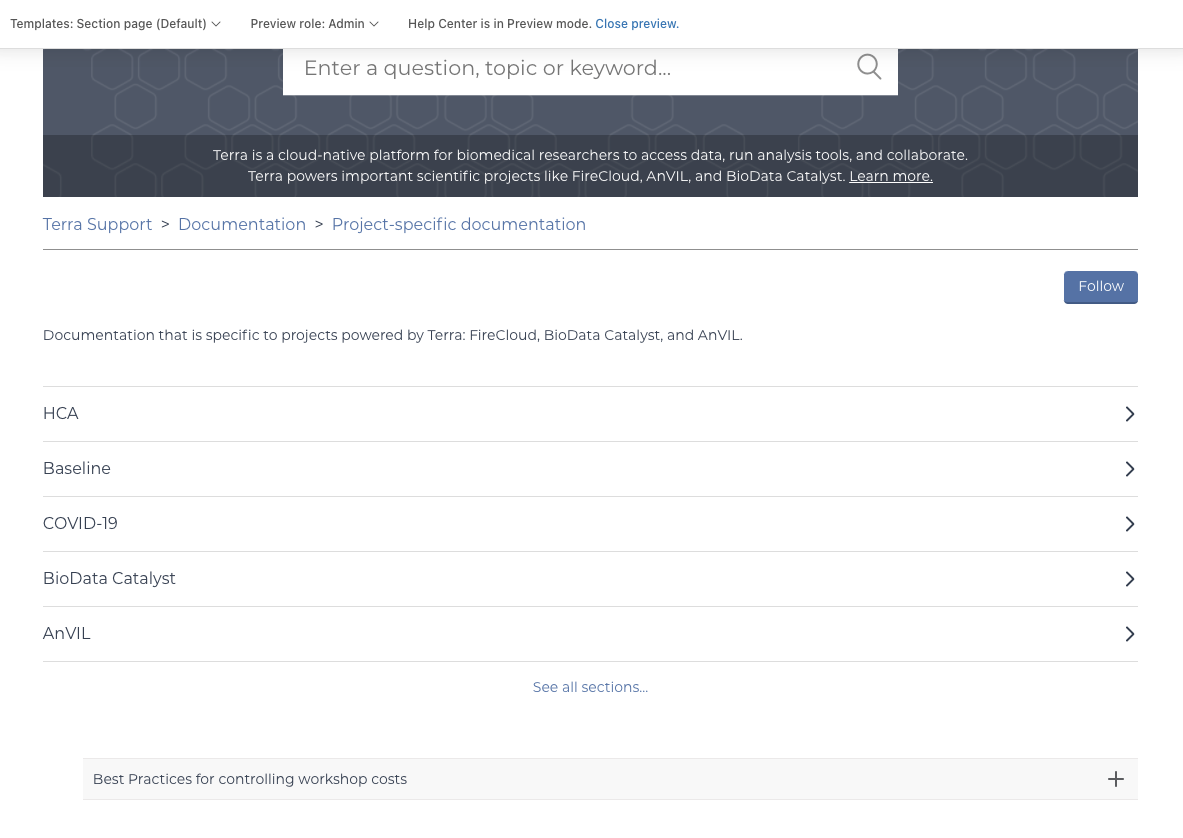
0
10 comentários
Amy Gracer
I have this working. Here is a screen capture of my page:
And my code
  {{#if section.articles}}
        <ul class="article-list">
          {{#each section.articles}}
            <li class="article-list-item {{#if promoted}} article-promoted{{/if}}">
              <a href="{{url}}" class="article-list-link">{{title}}</a> {{#if promoted}}
                <svg xmlns="http://www.w3.org/2000/svg" width="16" height="16" focusable="false" viewBox="0 0 12 12" class="icon-star" title="{{t 'promoted'}}">
                  <path fill="currentColor" d="M2.88 11.73c-.19 0-.39-.06-.55-.18a.938.938 0 01-.37-1.01l.8-3L.35 5.57a.938.938 0 01-.3-1.03c.12-.37.45-.63.85-.65L4 3.73 5.12.83c.14-.37.49-.61.88-.61s.74.24.88.6L8 3.73l3.11.17a.946.946 0 01.55 1.68L9.24 7.53l.8 3a.95.95 0 01-1.43 1.04L6 9.88l-2.61 1.69c-.16.1-.34.16-.51.16z"/>
                </svg>
              {{/if}}

              {{#if internal}}
                <svg xmlns="http://www.w3.org/2000/svg" width="16" height="16" focusable="false" viewBox="0 0 16 16" class="icon-lock" title="{{t 'internal'}}">
                  <rect width="12" height="9" x="2" y="7" fill="currentColor" rx="1" ry="1"/>
                  <path fill="none" stroke="currentColor" d="M4.5 7.5V4a3.5 3.5 0 017 0v3.5"/>
                </svg>
              {{/if}}
            </li>
          {{/each}}
        </ul>

      {{/if}}


      {{pagination}}

<div class="section-tree">
        {{#each section.sections}}
        <section class="section">
          <h3 class="section-tree-title">
            <a href="{{url}}">{{name}}</a>
          </h3>
          {{#if articles}}
          <ul class="article-list">
            {{#each articles}}
            <li class="article-list-item {{#if promoted}} article-promoted{{/if}}">
              {{#if promoted}}
              <span data-title="{{t 'promoted'}}" class="icon-star"></span>
              {{/if}}
              <a href="{{url}}" class="article-list-link">{{title}}</a>
              {{#if internal}}
              <span class="icon-lock" title="{{t 'internal'}}"></span>
              {{/if}}
            </li>
            {{/each}}
          </ul>
          {{else}}
          {{/if}}
          <a href="{{url}}" class="see-all-articles">
            {{t 'show_all_articles'}} and available sections
          </a>
        </section>
        {{/each}}
      </div>
0
Ifra Saqlain
Hey Zen,
Your code sequence is fine as you want to show articles accordion and then subsections, I think your main container has CSS that contains a column-reverse property that's why your hierarchy is showing the opposite. See, I used your code and get that article content showing above to subsections:
If any query let me know.
Thanks
Team
0
Zen Master Of Terra
Thanks for the reply, @...! I'm pretty new (novice) to css, so I'm not sure how to undo the row-reverse property (or if that will impact other things in a way I don't want!).
I found this in the theme css:
@media (min-width: 1024px) {
.article-container {
-webkit-box-orient: horizontal;
-webkit-box-direction: normal;
-ms-flex-direction: row-reverse;
flex-direction: row-reverse;
}
}
I tried just deleting the two lines below, but that didn't work.
-ms-flex-direction: row-reverse;
flex-direction: row-reverse
I tried subbing in the code @... suggested, but that didn't fly either. Any suggestions?
0
Ifra Saqlain
Replace your above mentioned code with this updated code on section page:
Add this CSS at the bottom of your stylesheet:
.section-page-container{display: flex;
-webkit-box-orient: vertical;
-webkit-box-direction: normal;
-ms-flex-direction: column-reverse;
flex-direction: column-reverse;
flex: 0 0 100%;
}
Or
You can share public URL of your section page then I'll find the issue via developer tool.
Thanks
Team
0
Zen Master Of Terra
@... I haven't published my section template (am playing with it first to make sure it works the way I want), only looked in preview mode. This is the section page I am trying to change: https://support.terra.bio/hc/en-us/sections/360007648652-Project-specific-documentation
Our Zendesk domain is https://support.terra.bio/ and the template I am working with is https://support.terra.bio/theming/editor/cb7060d2-ed9e-4384-ada5-5429a626fce9/templates/section_pages/AH_section-template.hbs
0
Ifra Saqlain
Hi, I tried to enter in the source code but I couldn't enter in the Guide Admin Screen via this link:
https://support.terra.bio/theming/editor/cb7060d2-ed9e-4384-ada5-5429a626fce9/templates/section_pages/AH_section-template.hbs
Your code structure is working fine which you have given above.
Can you provide the screenshot of your section page code?
I have reviewed your section page on
https://support.terra.bio/hc/en-us/sections/360007648652-Project-specific-documentation
and I saw opposite sequence of subsection's <ul> and article's <ul>:
1). Sub-Section <ul> ,2). Articles <ul>.
You need to just follow the above code which I gave, I only wrapped the subsection <ul> and article <ul> in the parent wrapper
and add the CSS in that wrapper,
.section-page-container{....}nothing is extra, infect there should has been a parent wrapper to wrap both <ul> tags. You should add the parent wrapper and CSS which I gave and test on mobile, tablet, desktop.
Try once and let me know or let me provide the access of your Guide Admin Screen so I can reach to your section page source code.
0
Zen Master Of Terra
@... Saqlain I don't know how to give you access to the Guide Admin Screen. If you can tell me how, I will happily give it!
As a workaround, I made and published a new template (using your code from two days ago). I have applied that template to a public page: https://support.terra.bio/hc/en-us/sections/360007274612-WDL-Documentation that you should be able to see.
It still displays the subsections before the articles:
P.S. I added the .section.page.container css to the bottom of our custom theme.
0
Ifra Saqlain
Hi,
See
I did some changes to the CSS. You need to do this:
1). Go to the CSS file and update the CSS which I gave.
.section-page-container{display: flex;
-webkit-box-orient: vertical;
-webkit-box-direction: normal;
-ms-flex-direction: column; // Column not column-reverse
flex-direction: column; // Column not column-reverse
flex: 0 0 100%;
}
Remove column-reverse and add column only.
2). And add this CSS also to remove the added padding and fix the alignment:
.section-content-container ul.article-list{padding: 0;
}
Now you have done and publish the updated section page.
Have a Good Day.
0
Zen Master Of Terra
@... That did it! Thanks so, so much for your patience and help. It also solved an additional problem we had where clicking into a section with subsections would only show the subsections, not the articles, unless users refreshed!
0
Ifra Saqlain
Awesome! you did it :)
0