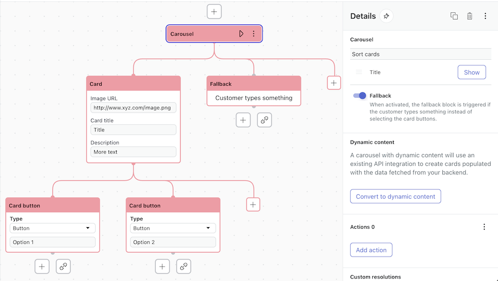
A carousel is a rich messaging block type within a dialogue for an AI agent. It displays up to 10 options, each with a visual element called a card. Carousels provide a visually pleasing way for customers to make a selection from options presented to them by the AI agent.
About the carousel block
-
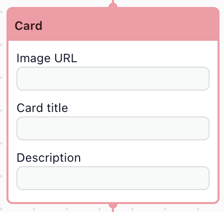
Card block: Represents the first card in the carousel. It includes fields for
image URL, card title, and description.
-
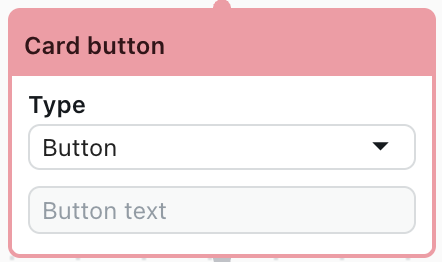
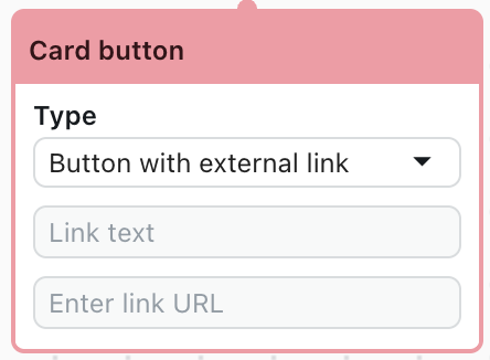
Card button block: Represents a button element on the associated card. Each
button can be one of two types: a standard button, or a button with an external link.
You can add a fallback for users who don't interact with the carousel using the Fallback toggle in the Details pane. A fallback block appears in the dialogue and can be configured as an alternate branch.
Carousel blocks are available only for messaging AI agents, and only with certain CRMs. CRMs may have specific requirements and limitations for carousels.
CRM-specific requirements and limitations
Using carousels with Sunshine Conversations
Sunshine Conversations has the following requirements and limitations in its support of rich format messaging.
| Block type | Component | Sunshine Conversations limitations |
|---|---|---|
| Card | All fields |
|
| Card count |
|
|
| Images |
|
|
| Card title |
|
|
| Description |
|
|
| Card button | Button count |
|
| Button text |
|
|
| Button with external link |
|
Using carousels with Zendesk Chat
Zendesk Chat has the following requirements and limitations in its support of rich format messaging.
| Block type | Component | Zendesk Chat limitations |
|---|---|---|
| Card | All fields |
|
| Card count |
|
|
| Images |
|
|
| Card title |
|
|
| Description |
|
|
| Card button | Button count |
|
| Button text |
|
|
| Button with external link |
|
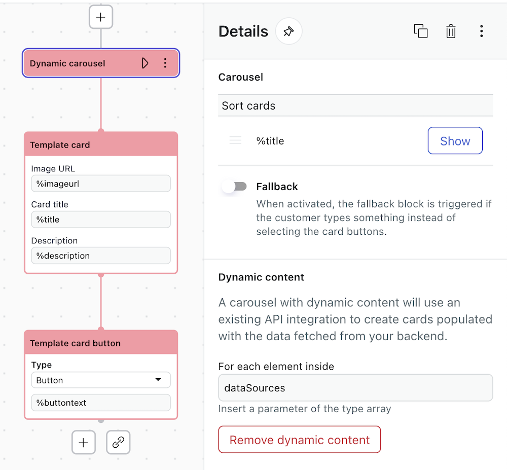
Populating carousel cards via an API integration
A carousel is static by default, but can be converted to a dynamic carousel in order to use content fetched from an existing custom API integration. In a dynamic carousel, the card and card button blocks are templates that contain the dynamic content.
-
In the dialogue builder, click the plus (+) icon to add a
carousel block.
The dynamic carousel block appears along with the first template card block, a fallback block, and a Details pane.
- To remove the fallback (optional), deselect Fallback on the Details pane.
Otherwise, it can be configured as an alternate branch.
- In the Details pane, click Convert to dynamic carousel and enter
dataSourcesas the array type parameter. - In the template card block, enter text or parameters such as
%imageurl,%title, and%descriptionin the respective fields. - In the template card button block, enter text or a parameter such as
%buttontext.