When you need more control over your report, you can create it, or enhance a prompt-based report using report builder. As well as giving you complete control over what's displayed, you can also add filters, control the visualization type, and add other advanced features. You can create most simpler reports by supplying a natural-language prompt.
Creating a report manually
Use the following procedure to manually create a report using report builder.
To create a report manually
- In Analytics, click the Analyst copilot
icon (
 ) in the sidebar.
 - Click the create icon (+), then select Report.
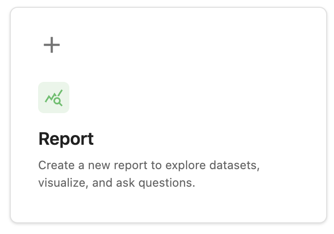
- On the Select a dataset to query page, click the dataset containing the information you want to report, for example, Support tickets. A new page opens with a blank report.
- In the Fields panel, select any measures you need, for example, Ticket count. You can drag the measure you want from the left sidebar, or click +, then select it from the list.
- In the Groupings panel, add any dimensions you need, for example, Assignee name.
You can drag the dimension you want from the left sidebar, or click +,
then select it from the list.Tip: If you're not sure what to choose, hover over a metric or dimension to display a tooltip containing a description of it.
- Add any required filters to your report. Under the
filters panel, click the add icon (+).Tip: Filtering limits the rows that are included in the report results. Filtering happens before grouping.
Grouping buckets results to compare aggregates (for example, by agent, channel, or month). Grouping happens after filtering.
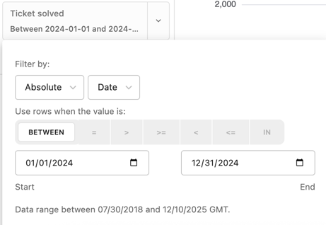
- In the filter chooser, choose what you want to filter by. For example, click the filter, Ticket solved. The filter is added to your report.
- Click the filter you just added.
- In the filter options, configure the filter behavior. For example, to
set a date range, you could configure the following values:
- Filter by: Select the type of filter you want.
- Use rows when the value is: Select how you want to filter, for example, between, or equals.
- Start and end dates: Set these values to the start and end of the period you want to display.
- Under the filters panel, click the add icon (+).
- In the filter chooser, click Assignee name. The filter is added to your report.
- Continue to add filters and groupings as required.Tip: While you are creating the report, watch the status indicator at the bottom left of the page. This provides helpful suggestions to improve your report and also informs you when your actions are added to analyst copilot's memories, where they can be accessed later.
Changing how your report is displayed
Once you've created a report, you can add more information to it or change how it's displayed.
Changing a report visualization type
You can choose from a range of visualization types such as tables, pie charts, and column charts to present your report how you want.
To change the visualization type
- Open a report, then click the Type drop down in the Visualization section.
- From the list, select the visualization type you want.
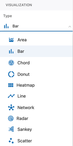
The report updates to display the new visualization type. For information about the available visualization types, see Understanding analyst copilot report visualizations.
Changing report general settings
Analyst copilot offers several settings that you can use to control how your report appears.
To change report general settings
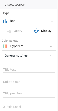
- In the Visualization settings panel of report builder, click the Display tab.
- Configure one or more of the following settings. The available settings will
differ depending on the visualization type you're using.:
- Color palette: Choose one of the available color schemes to change the colors used in your report.
- Title text: Add a title to your report. By default, this is displayed in the upper-left corner of the report.
- Subtitle text: Add a subtitle to your report. This is displayed under the title.
- Title position: Choose the text justification for your title and subtitle,
- X-axis label: Enter a new title for the X-axis is you don't want to use the default title.
- Y-axis label: Enter a new title for the X-axis is you don't want to use the default title
- Display legend: Turn off or on the report legend.
- Value axis min: Enter the minimum value to display in your report.
- Value axis max: Enter the maximum value to display in your report.
-
Stack values: Display each bar, column, or other element
divided into colored segments, with each segment representing part
of the total for that group. This lets you see both the overall
total and how various parts contribute within each bar or column.
- Stack 100%: Show percentages instead of counts. Each element, such as a bar or column will take up 100% of the total for that group.
- Show sum: displays the total value for each bar or column at the top of the stack. When you turn on this setting, a numeric label appears above every stacked bar (or column), showing the combined value of all the segments in that group.
- Vertical: Changes the orientation of the report between horizontal and vertical.
-
Small multiples: Breaks a single report into a grid of many
smaller charts, each showing a slice of your data for a different
value of one or more grouping fields. Instead of overlaying all data
series on one chart, each small multiple panel gives you a
side-by-side comparison of trends or patterns across groups (like
agents, products, or time periods). This makes it easy to spot
differences across categories because the chart structure remains
consistent, but the data changes per panel.
- Small multiples layout: Choose the layout for your small multiples, or select auto if you want analyst copilot to choose the best layout.
- Slant categories: Angles the category labels on your chart’s axis, usually the x-axis. This makes it easier to read long or densely packed category names, especially when there are many of them.
- Show values: Numeric values are displayed directly on your charts, such as on each bar in a bar chart, segment in a stacked chart, or point in a line or area chart. This setting overlays the actual numbers (or percentages, depending on your chart type) on top of the visual elements, making it easy for viewers to see the exact values without hovering or cross-referencing a legend.
- Log axis: Changes the scale of your chart’s value axis from linear to logarithmic. This setting spaces out the axis values by orders of magnitude (for example: 10, 100, 1,000, 10,000) instead of evenly (like 0, 2,000, 4,000, 6,000). This makes it easier to visualize data sets that cover a very wide range of values or that have exponential growth, allowing trends and differences to be seen more clearly and preventing large values from overwhelming small ones on the chart.
Using conditional formatting
- Business leaders or supervisors often require "at-a-glance" visual cues (for example, red for low performance, green for targets met) driving immediate, actionable insights, accelerating decision-making speed, and reducing cognitive load for users.
- Support agents appreciate the ability to view their performance against their peers or a benchmark, so they can easily see if they need to take action to improve their performance.
To conditionally format report results
- Open a report, then click Conditional formatting.
- In the Add conditional formatting panel, configure the following:
- Apply conditional formatting to: Choose the measure you want to conditionally format.
- Field: Choose what you want to measure, for example, Ticket status.
- Operator: Choose the operator you want to use. The available operators will vary depending on the field type you choose. Example include, is, is greater than, and equals.
- Value: Choose the value you want to evaluate for formatting.
- Fill color: Choose the color that the result will be displayed in if it evaluates as true.
- Click Apply.
Your new rule is displayed

Example
You configure a rule with the following values:
- Field: Ticket status
- Operator: is
- Value: Open
- Fill color: Red
Analyst copilot displays open tickets in red.
Configuring advanced report options
There are several capabilities you can use to fine-tune your report configuration and presentation.
To configure advanced report options
- Open a report, then click the options
menu (
 ) .
) .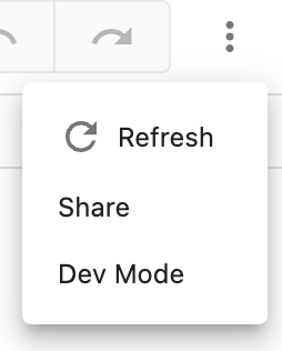
- Select one of the following options:
- Refresh: Refreshes your report with the latest results.
- Share: Opens the share report page where you can share a URL to your report, or save it as an image file.
- Dev mode: Displays the report configuration in JSON format. You can modify the configuration as required.
Using suggestions to give reporting ideas
You can use either AI-powered or manually-generated suggestions to give you ideas on further reports you might find useful.
To use AI-powered suggestions
- In a report, review the suggestions at the bottom of the page when a memory is created.
- Click the suggestion you want to review.
The suggestion is expanded with more information.
- Click Apply suggestion to update your report or click Try
this in a new report to open the suggestion in a new report.

To manually generate suggestions
- Open the memories panel.
- Click a memory for which you want to generate suggestions.
- In the memory narration panel, click the find inspiration icon (
 ).
).Analyst copilot displays suggestions at the bottom of the page.
Changing dimension and measure display options
Analyst copilot provides several options for changing how your measures, dimensions, and groupings are displayed. The available options will differ depending on the element you are changing settings for.
To change dimension, measure, and grouping options
- In report builder, click the down arrow next to a measure, dimension, or grouping.
- From the field options, select one of the following options:
- Sort descending: Sorts the selected item by numerical or alphabetical order, starting with the highest value.
- Sort ascending: Sorts the selected item by numerical or alphabetical order, starting with the lowest value.
- Add as aggregate filter: When you add an aggregate filter, it appears in the filters list. You can click the new filter to define what gets displayed. For example, you could select between 1 and 100 to only display values matching the filter.
- Add field filters: Adds a filter below the selected item. You can configure the filter to display only the values you want, for example, tickets from the help center channel.
- Manage value formatting: Controls how values from the selected dimension are formatted. For example, you could select currency, then choose US dollars to display numbers in dollars, for example, $250.00. If you choose duration, the source value you are formatting from must be in seconds.
- Cumulative: Adds a running total to your report, calculated over the order of your groupings. For example, if you’re grouping data by month, a cumulative sum would show each month’s value plus all previous months, building up as you go down the list.
- Rename: Renames the selected item. The item will appear in your reports with the new name.
- Hide: Hides the selected item from your report, but does not remove it.
- Remove: Removed the selected item from your report.
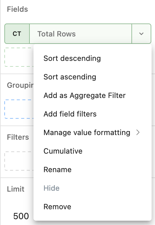
The measure, dimension, or grouping updates to reflect your new configuration.
Saving reports
Once you've finished editing your report, save it so you can work on it later, or share it with others.
To save a report
- Open a report, then click Save or
Save as.

- Provide the following information:
- If you're saving a report for the first time:
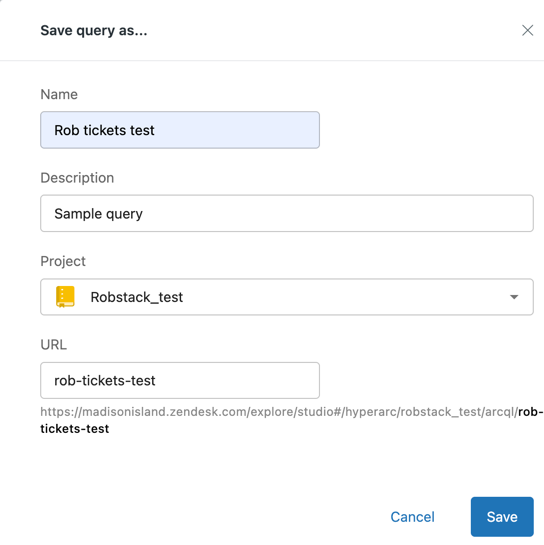
- On the Save report as page, provide the following
information:
- Name: Enter a name for the report.
- Description: Optionally, enter a description for the report.
- Project: Choose the project where your report will be saved.
- URL: The URL for the report is created automatically from the report name, but you can change this if required.
- Click Save.
- On the Save report as page, provide the following
information:
- If you're saving a report that was previously saved:
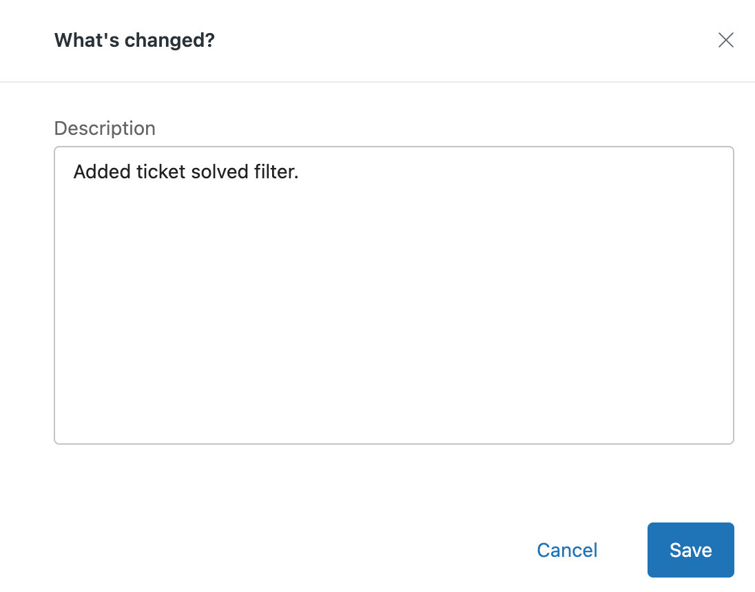
- On the What's changed page, review the AI-generated summary of changes since you last saved, or provide your own summary.
- Click Save.
- If you're saving a report for the first time: