Summary: ◀▼
The conversational help center is an AI-powered help center experience that lets you answer questions in natural language while still browsing articles, categories, and sections. You can install the Lisbon theme, customize branding, hero text, featured banners, and alerts, then preview and publish it. It requires quick answers, AI agents, the web widget, and multi-conversations.
The conversational help center is an AI-powered help center experience that combines natural-language question answering with standard help center navigation. End users can enter questions in a prompt field to receive quick answers generated from help center content, along with links to the source articles used to support the response. Users can also continue to browse categories, sections, and articles, resulting in a conversational experience that supplements existing self-service options rather than replacing them entirely.
The conversational help center is intended to help customers improve self-service outcomes while reducing the effort required to configure and maintain the experience. It combines AI-powered answering with familiar help center content, which can help users get to relevant information more quickly.
Knowledge admins can set up the conversational help center by installing the Lisbon theme and configuring the available experience settings in the theme editor. These settings include branding and layout options for elements such as the hero area, featured banners, alerts, and color treatments.
- Understanding the conversational help center
- Requirements
- Turning on the conversational help center
- Install the Lisbon theme
- Configuring the conversational help center
- Setting up multilingual content
- Preview and publish the conversational help center
- Customizing the end user experience
- Limitations of the conversational help center
Understanding the conversational help center
The conversational help center gives end users a guided self-service experience. Instead of relying only on keyword search or browsing through categories and sections, users can also ask questions in natural language and receive quick answers based on published help center content. Quick answers display links to the source articles used to generate that answer, which gives users an immediate response while preserving access to the underlying documentation.
After reviewing the quick answer, users can decide how to continue. Depending on the UI and configuration, they can either open a source article link or type a follow up question in the Ask follow-up field.
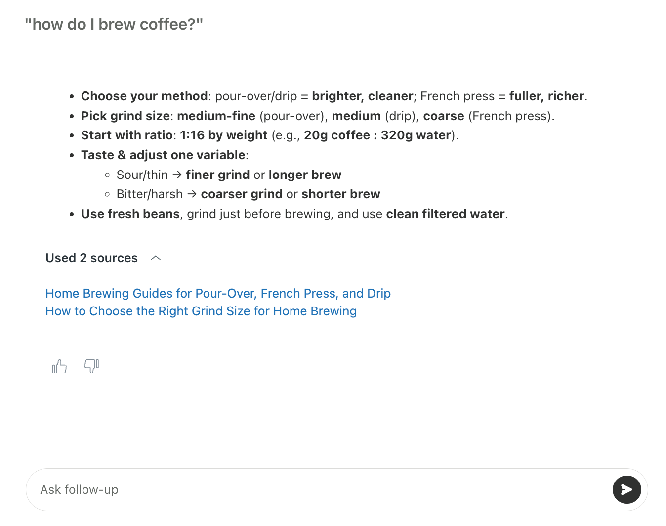
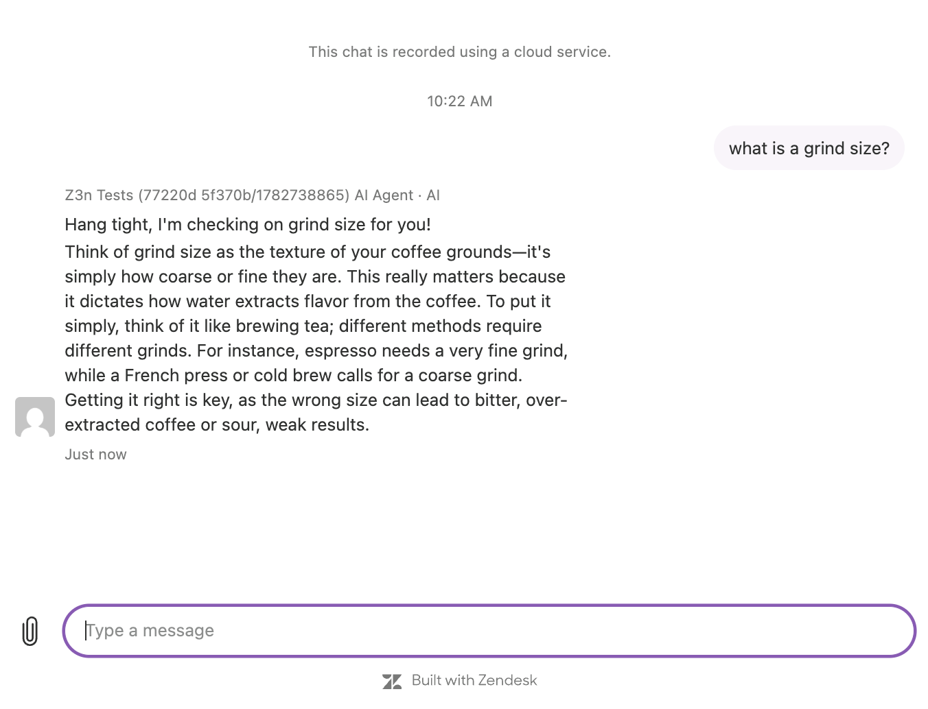
If the user asks a follow-up question, the experience can move from a quick-answer interaction into a broader conversation. At that point, behavior depends on how your AI agent and procedures are configured. For example, the AI agent might continue the conversation, guide the user through a supported workflow, hand the conversation off to a human agent, or direct the user toward ticket creation.
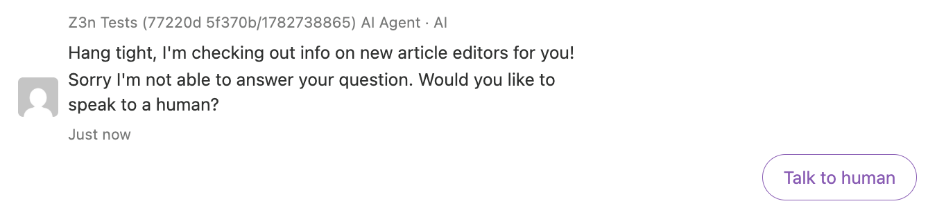
If the system can’t find a relevant answer, the user sees an empty state. This indicates that no supported answer was found for the question and signals that the user may need to try a different query or continue through another support path.
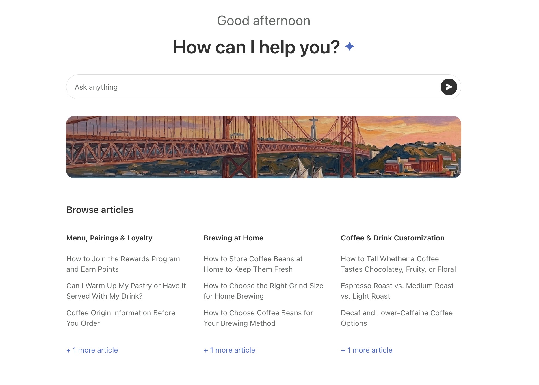
The conversational experience is delivered through the Lisbon theme. The theme features a conversational layout and a set of UI-based customization options that knowledge admins can manage without editing code. These options include branding controls, a configurable hero area, featured banners, global alerts, dark mode support, and mobile-compatible layouts. For more information, see Configuring the conversational help center
Requirements
Before you install and use the conversational help center, confirm that the required supporting features are already configured in your account. The conversational experience depends on these features for answer generation and follow-up behavior.
Keep the following implementation considerations in mind:
- If you support multiple languages in your help center, use dynamic content where appropriate.
- Follow-up conversations depend on your AI agent procedures. If procedures are incomplete or unavailable for a user’s request, the experience may hand off to another support path.
- Review how your existing articles appear when using dark mode. Make any necessary adjustments before publishing the theme.
Turning on the conversational help center
You can enroll in the conversational help center EAP from within Admin center. After you select the EAP and update your settings, you'll have automatic access to the conversational help center functionality.
- In Admin Center, click
 AI in the sidebar, then select Knowledge .
 - Under Lisbon theme, click Turn on the Conversational Help Center - Lisbon Theme
(Early Access Program).
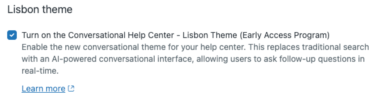
- Click Save.
Install the Lisbon theme
After you enroll in the EAP, you can install the Lisbon theme from the help center theme options.
To install the Lisbon theme
-
In Knowledge admin, click Customize design
(
 ) in the sidebar.
The Themes page opens.
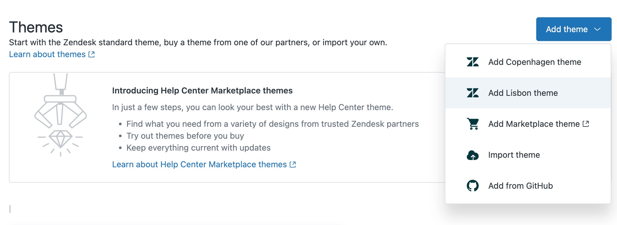
- Click Add theme, then select Add Lisbon theme.
-
Continue to Configuring the conversational help center.
Configuring the conversational help center
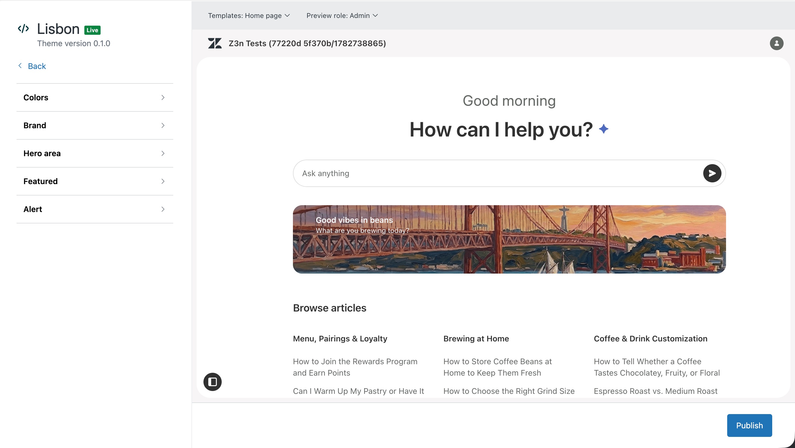
- Theme branding: Controls the colors, logo, and help center name that align your help center with your brand.
- Hero area: Main content area at the top of the help center home page. You can use this area to show a custom greeting and supporting text (for example, "Good morning How can I help you?" in the example below) and custom placeholder text in the search field (for example, "Ask anything" in the example below).
- Featured banners: A banner (either an image, as shown below, or colored text) used to emphasize important announcements or direct users to important actions. In addition to the banner itself, you can use this section to customize a title, message, and button (with button text).
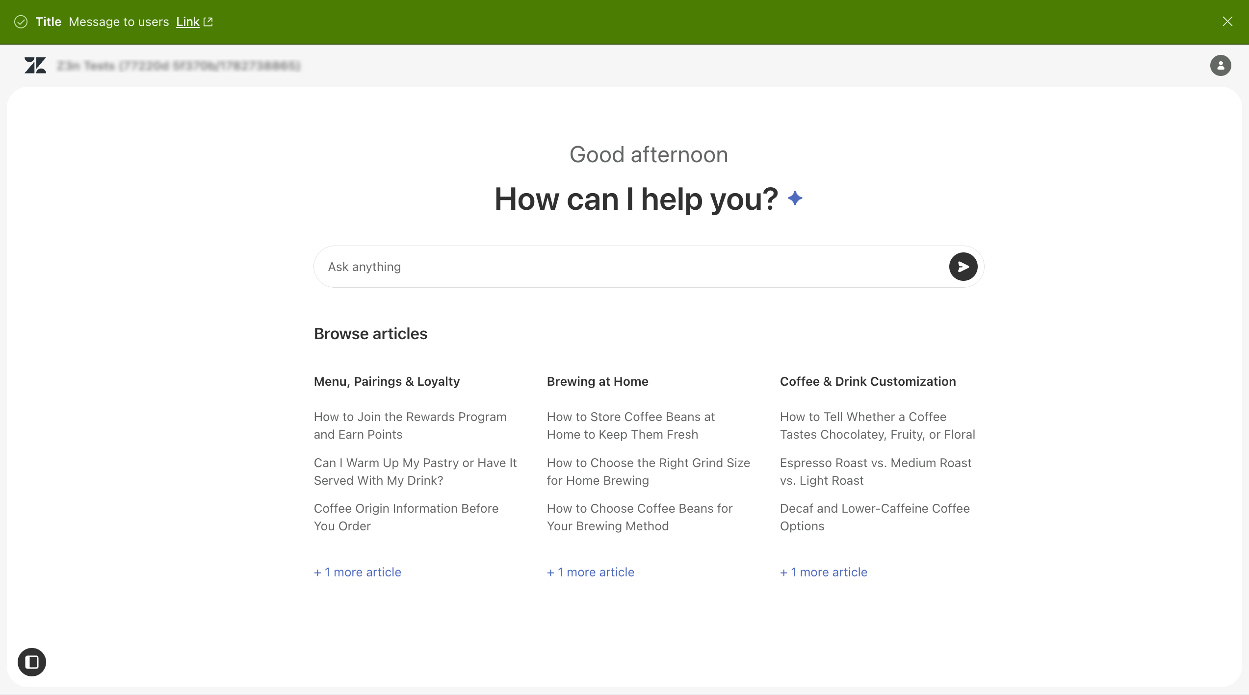
- Global alerts: Colored bands that appear at the top of the help center to display high-visibility messages. You can use global alert banners to display Info, Warning, Error, or Success messages with accompanying links to help direct help center visitors to more information.
- In Knowledge admin, click Customize design
() in the sidebar.
- Click Customize on the Lisbon theme you want to update.
The theme page opens.
- To configure the theme branding, do the following:
-
In the Settings panel, click Colors.
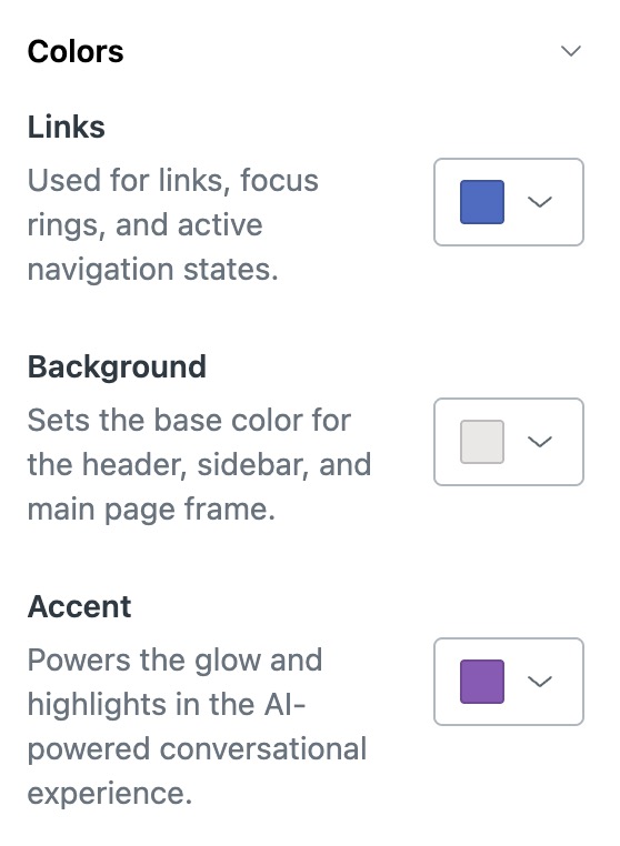
- Click the color box beside any of the options, then use the color selector to
choose a color or manually enter the number for your color.
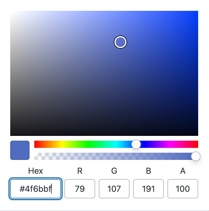
The color updates in the preview window.
- In the Settings panel, click Brand.
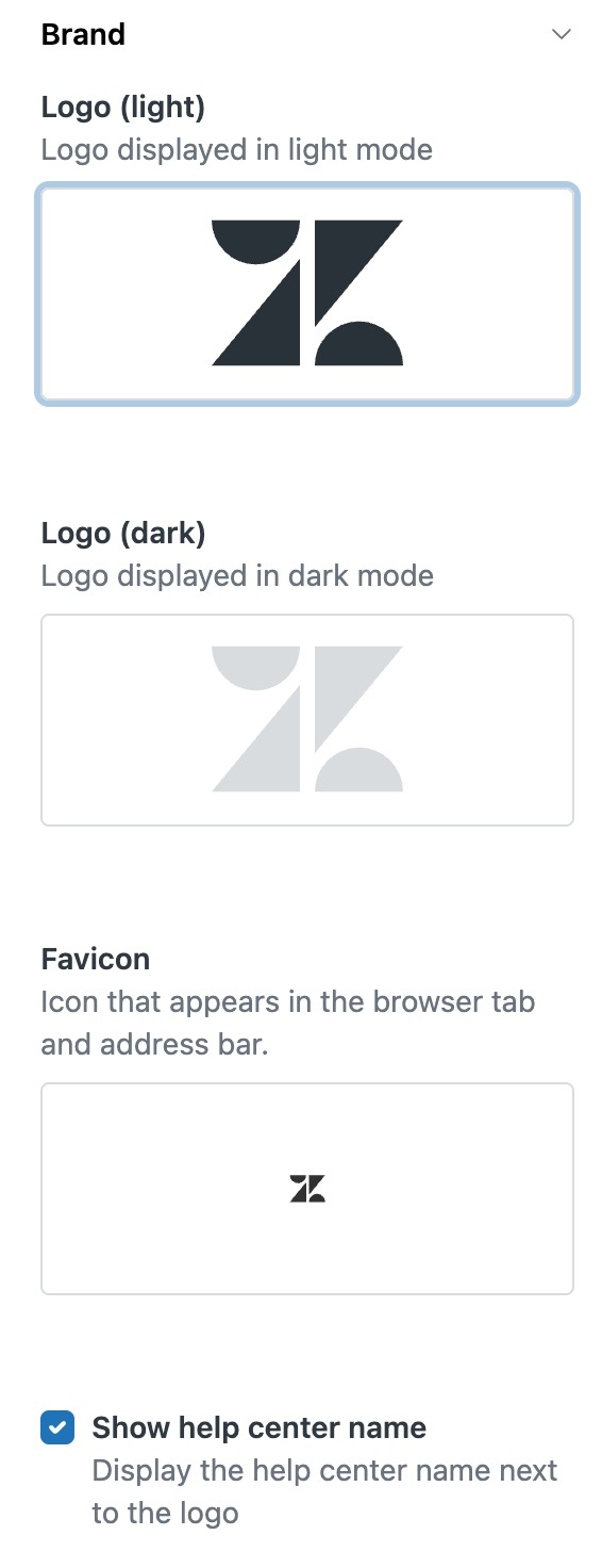
- Click the displayed logo or favicon to browse to and select an image:
-
Logo (light) and Logo (dark): Your logo as it appears in light mode or
dark mode. Users can select light or dark mode by clicking the Open sidebar icon
(
 ) on the help center home page, then
selecting the color scheme.
) on the help center home page, then
selecting the color scheme. - Favicon: The image representing your help center that appears on the user browser tab and address bar.
The recommended image size is 200px by 50px. If the width or height of the image exceeds the recommended size, the image is scaled down to keep the aspect ratio constant. The image background should be transparent or match the background color of the header.
-
Logo (light) and Logo (dark): Your logo as it appears in light mode or
dark mode. Users can select light or dark mode by clicking the Open sidebar icon
(
- Click Show help center name to display your help center name next to your logo on the help center.
-
- To configure the hero area, do the following:
-
In the Settings panel, click Hero area.
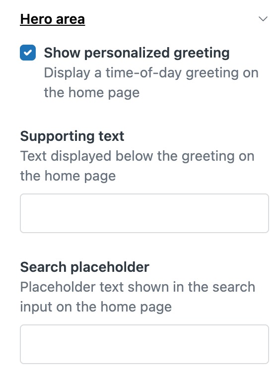
- To display a custom greeting in place of the "How can I help you?" text
on your help center home page, select Show personalized greeting, then in the
Supporting text field, type the greeting you want displayed.
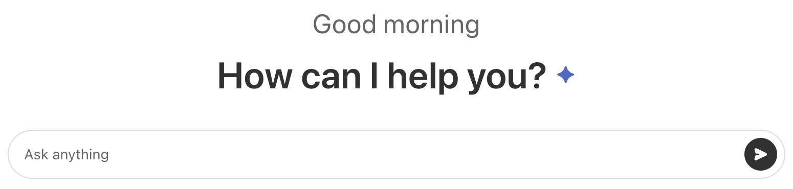
- To display a custom placeholder in the search field (instead of the
default "Ask anything"), then in the Search placeholder field, type the text
you'd like to display.

-
- To add a featured banner, do the following:
-
In the Settings panel, click Featured.
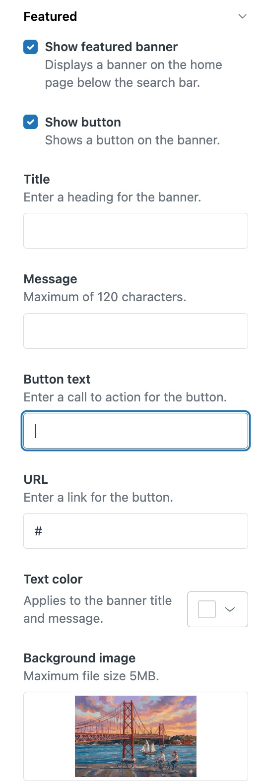
- Select the Show featured banner check box to display a banner on the home page of your help center, directly below the search bar.
- Use the following fields to configure the way the featured banner appears to
users:
- Title: Enter heading text that appears on the banner image.
- Message: Enter text that appears directly below the title on the banner image.
- Text color: Select the color that you want to apply to the Title and Message text.
- Background image: Select the image that you want to use for the banner. The maximum size for image files is 5 MB.
-
Click Show button to add a button to the banner.
- Use the following fields to configure the way the button appears to users.
- Button text: Enter a call to action that you want to appear on the button.
- URL: Enter the URL link that you want to open when users click the button.
-
- To add a global alert, do the following:
-
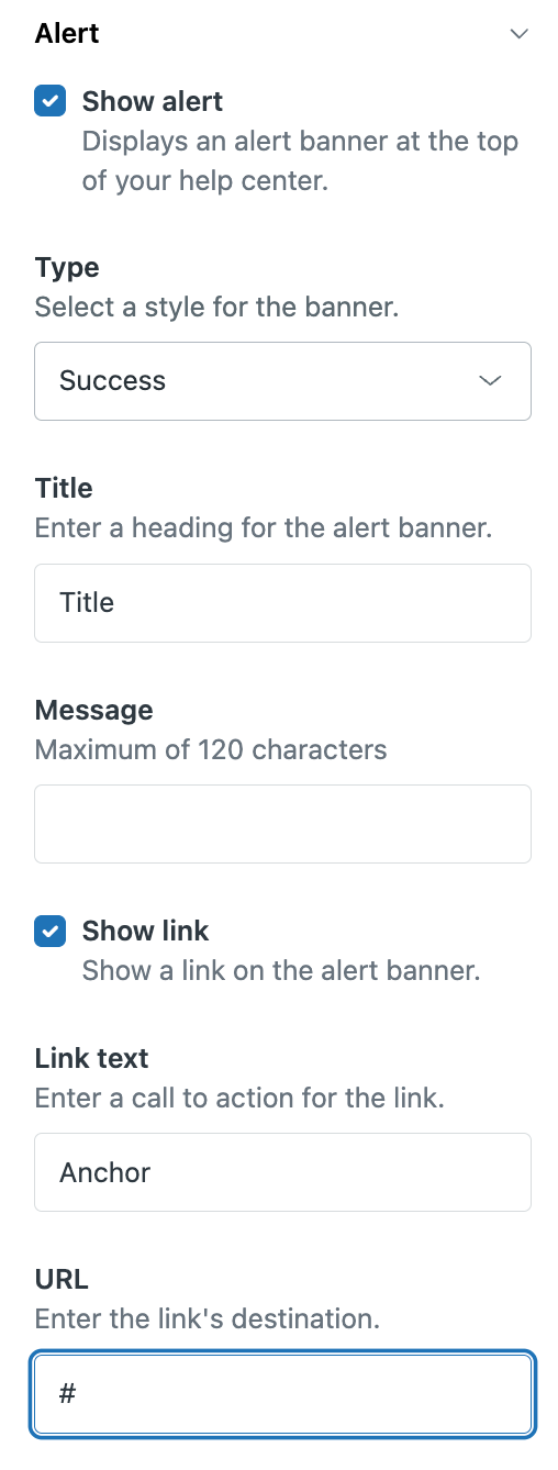
In the Settings panel, click Alert.
-
To show the alert banner at the top of your help center, select the Show alert check box.
- In the Type drop down, select the banner style that you want to display:
- Info: Light blue
- Warning: Yellow
- Error: Red
- Success: Green
- Configure the following fields to customize the message and link
displayed on the banner:
- Title: Heading for the banner
- Message: Text that you want to display to users (maximum of 120 characters)
- Show link: When selected, displays a destination URL that users can click to open a linked web page in a new browser tab.
- Link text: Text displayed on the link (for example, call to action or label)
The following image shows how these configuration items appear to users on the green Success banner.
-
Preview the alert.
-
-
Click Save.
Setting up multilingual content
If your help center supports multiple languages, use dynamic content for text elements that vary by language. This is especially important for theme-managed text such as hero messages, placeholders, banners, and alerts. Without dynamic content, users may see text that doesn’t match their selected help center language. See Localizing help center content.
Preview and publish the conversational help center
After enabling and configuring the Lisbon theme, you can preview the theme, make any necessary adjustments, then make it live in your help center. Once the theme is live, end users will see it by default when using your help center.
- In Knowledge admin, click Customize design
() in the sidebar.
- Click Customize on the Lisbon theme you want to update.
The theme opens to the Preview page.
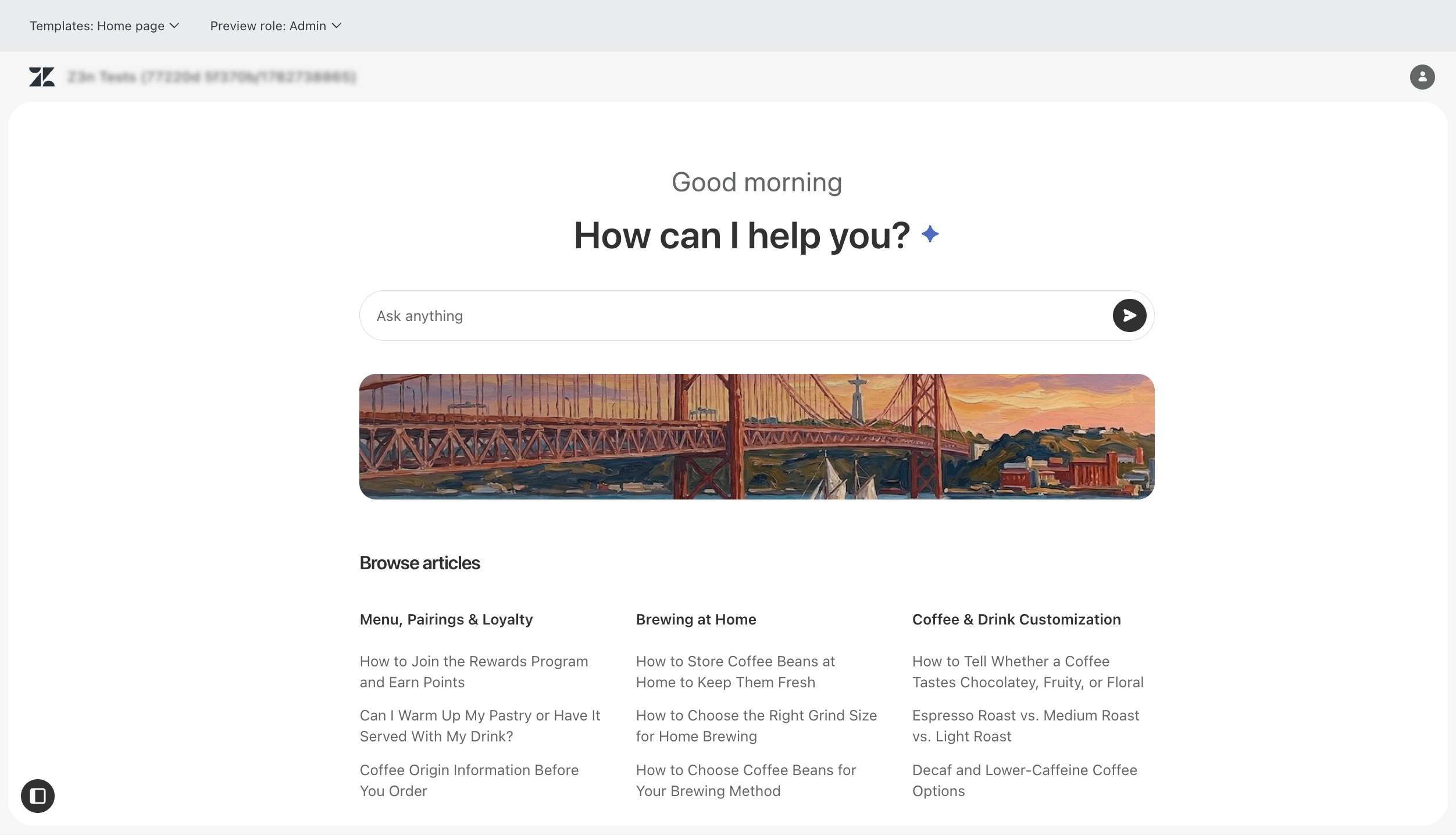
- Use the theme preview to click through your help center and review the user
experience. Specifically, be sure to check the following:
- How your existing articles appear in both light mode and dark mode
- Appearance of your customized UI elements (for example, hero image, banner text, etc.)
- Appearance of multilingual content (if configured)
- Theme branding
- How the conversational experience appears to end users
- If you need to make further adjustments, make them at this time.
When you're satisfied with the user experience and ready to make the help center live, continue to the next step.
- On the sidebar click < Back to return to the Theme page.
- In the Theme library, click the option menu icon (
 ) on the theme that you want to make live, then select Set
as live theme.
) on the theme that you want to make live, then select Set
as live theme. 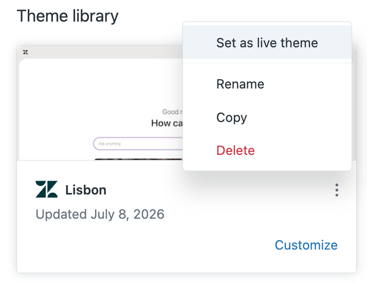
- Confirm that you want to make this theme live for your help center.
The theme moves to the top of the page and is applied to your live help center.
Customizing the end user experience
- Access the conversation experience
- Set light or dark mode
- Select the help center language (if multiple languages are configured)
- Open the help center, then click the side panel icon () on the lower left side of the help center home
page.
The side panel opens.
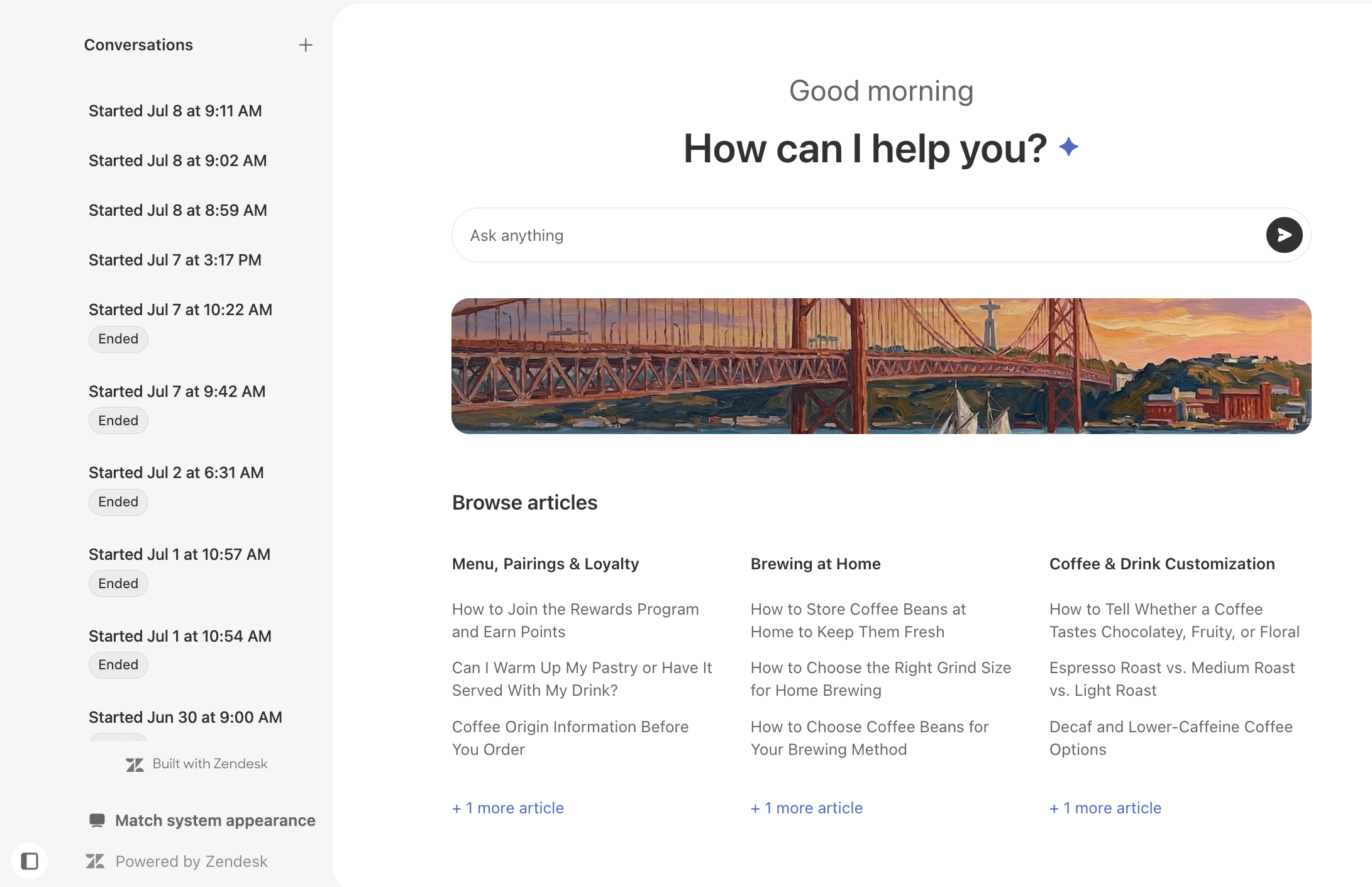
- To access the conversation experience, do one of the following:
- To start a new conversation, click the + icon on the top right of the side
panel.
The conversation view opens to a new conversation. You can type your message in the message field to begin your conversation.
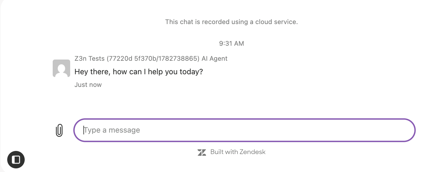
- To open an existing conversation, click the conversation from the side
panel.
The conversation opens in the conversation view. You can type a message in the message field to continue the conversation.
- To start a new conversation, click the + icon on the top right of the side
panel.
- To set light or dark mode, do the following:
- On the lower left of the side panel, click the color mode icon (
 to open the menu.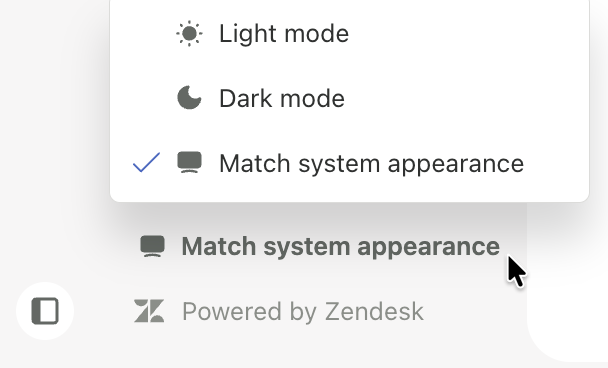
- Select the light or dark mode setting that you want to use for your help
center:
-
Light mode
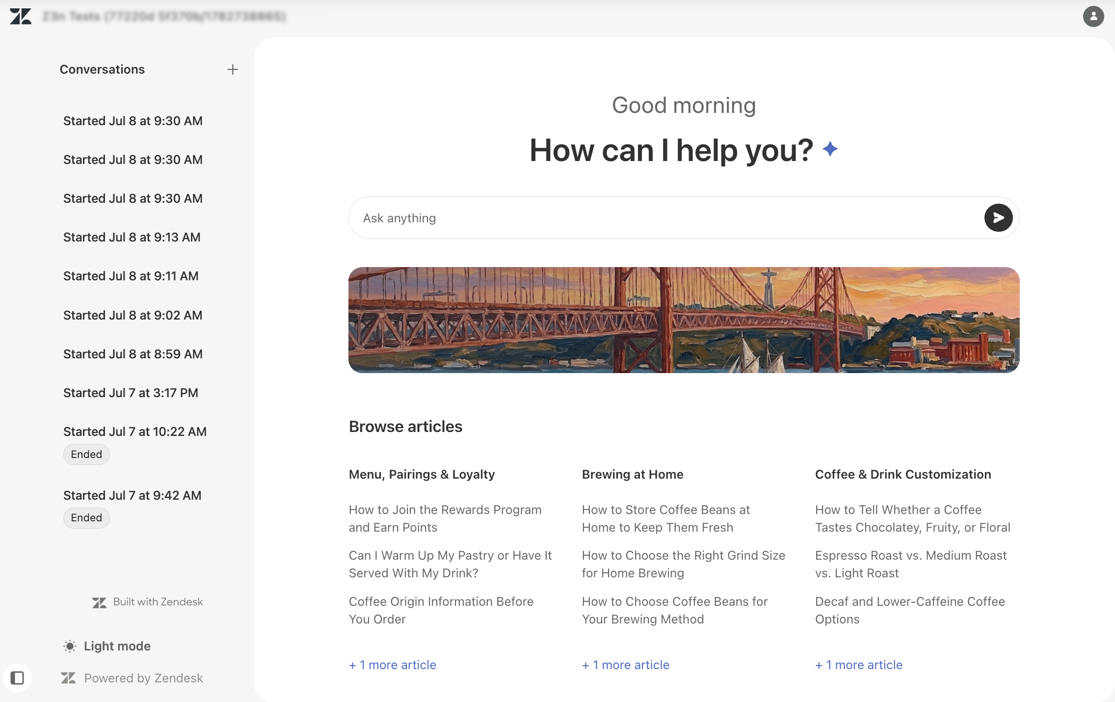
-
Dark mode:
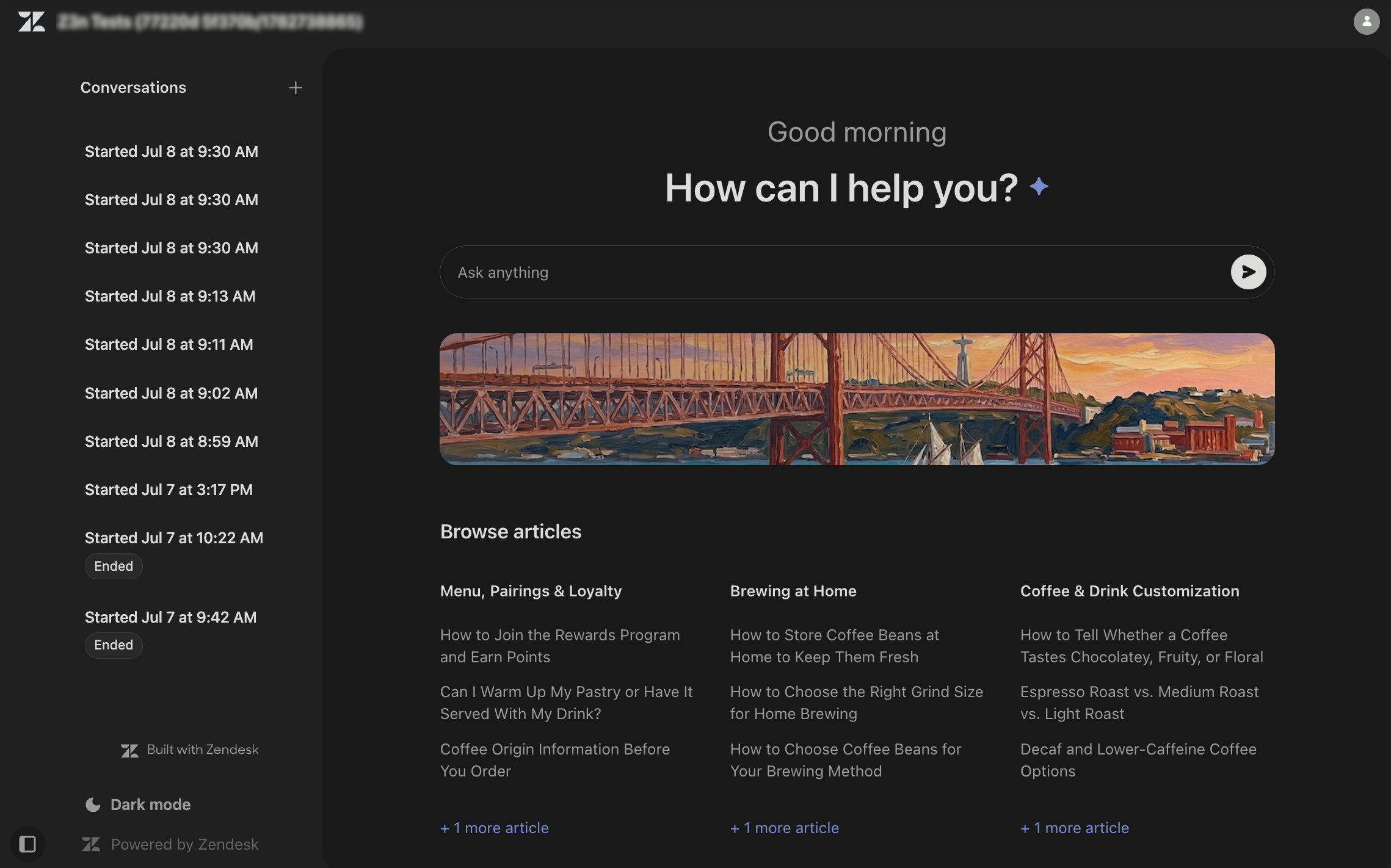
- Match system appearance: Match help center to current system settings.
-
Light mode
- On the lower left of the side panel, click the color mode icon (
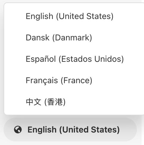
- To select the help center language:
- On the lower left of the side panel, click the language icon (
 ) to open the language selection menu.
 - Select the language that you want to use for your help center.
- On the lower left of the side panel, click the language icon (
Limitations of the conversational help center
For this EAP, the conversational help center includes the following limitations:
- Code-based theme customization isn’t part of the intended setup experience.
- Branding controls are more limited than in fully customized themes.
- The search input experience is simplified and doesn’t include instant search or predefined suggestions.
- Follow-up behavior depends on AI agent configuration and procedures.
- The following help center features are not available in the Lisbon theme:
- All community features (including user profiles, subscriptions, and contributions)
- New request form
- Service catalog
- Approvals
- Article voting
- Article comments
- By default, the Lisbon theme displays a "Built with Zendesk" logo on the side panel that originates from the Web Widget. If you want to remove this link, open Admin Center > Channels > Messaging. On the Messaging page, in the edit view for the General channel, expand the Style section. Deselect Show Zendesk logo. For more information, see Configuring the name and appearance of the Web Widget.