For this reason, you no longer need to migrate your existing Explore dashboards to the new dashboard builder. If you’ve already migrated, don’t worry. The new dashboard builder will remain live for the foreseeable future, and you can continue to use it.
Agentic analytics will be available later in 2026. Read more about agentic analytics.
After you create a dashboard, you can customize it to meet your business requirements.
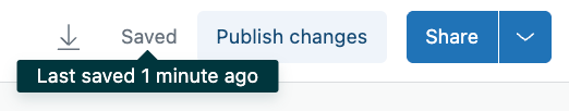
When you make changes to a dashboard, the changes are saved automatically, and a Saved status is displayed. You can hover over this status to see how recently the dashboard was saved.
After you make changes, dashboard viewers won't see them until you click Publish changes. See Sharing and publishing dashboards.
This article contains the following topics:
Adding dashboard components
Use the Add to dashboard panel to choose reports and other components that you want to add to your dashboard.
For details about adding components, see Adding and arranging dashboard components.
Changing the dashboard name
When you create a new dashboard, it will be named "Untitled". You can change the dashboard name to help you find the dashboard you need in the library.
To change the dashboard title
- In a dashboard, click the pencil icon next to the dashboard name. In this example, the
dashboard name is "Untitled".

- Enter a new name for the dashboard, then click Save.
Editing your report options
When you click any report in your dashboard, the report options menu displays. From here you can modify the report header, exclude the report from selected filters, or open the report for editing.

The report options menu contains the following options:
- Show header toggles the display of the component header.
- Background color applies the selected color as the background for your component header.
- Text color applies the selected color to the header text.
- Exclude from filters applies the selected text size to the header. See Adding interactive Explore dashboard components.
- Edit in report builder Opens report builder where you can make changes to the report.
Adding and customizing text
You can customize the text formatting if you've added a text component to your dashboard. Unlike the other customization options in the dashboard builder, there is no toolbar menu for customizing text. Instead, select the text you want to customize by selecting a section of text or by double-clicking a word.
The text customization options will appear as a pop-up under your selected text.
- Text size increases or decrease the size of your text.
- Text color changes the color of your text.
- Bold adds bold formatting to your text.
- Italics italicizes your text.
- Underline adds a line underneath your text.
- Hyperlink renders the selected text as a link. Enter a URL after you click this option.
- List orders your texts in a numbered list. Every time you press enter, a new line will be added with the next sequential number.
- Bullets adds bullet points in front of each new line of text.
- Justification opens a dropdown menu where you can select to left, right, or center-justify your text.
- Delete removes the selected text component.